7 SaaS Landing Page Elements That Convert

October 13, 2025
We've audited hundreds of SaaS landing pages at Aimers. Most look exactly the same; hero image, three-column feature section, generic testimonial from "John D., CEO." Then these companies wonder why their conversion rates hover around 2%.
Building a high-converting SaaS landing page isn't about following landing page templates. It's about understanding what makes someone actually pull out their credit card. We've helped SaaS companies like Mixpanel and Originality.AI dramatically improve their paid acquisition results, and a huge part comes down to getting the landing page design right.
So let's talk about what actually works, not what some dusty blog post from 2019 claims. What we're seeing convert right now, in 2025.
Why Most SaaS Landing Pages Fail to Convert (And How to Fix Yours)
Trying to be everything to everyone. That's the mistake.
Landing pages that try to speak to enterprise customers and solo founders in the same breath. Pages that list 47 features instead of explaining the one problem they solve. Your SaaS landing page has one job: convince a specific person that your product solves their specific problem better than anything else.
When we work on conversion rate optimization, the first thing we do is strip away everything that doesn't serve that goal. Suddenly? Conversion rates jump. Cost per acquisition drops.
Something we tell clients constantly: marketing rarely fails because of low traffic. The real leak is deeper in the funnel. You can drive thousands of visitors with Google Ads or LinkedIn campaigns, but if your landing page isn't doing its job, you're burning money. If you're not sure where the problem lies, our PPC audit service can help identify exactly where your campaigns are leaking revenue.
Element #1: A Hero Section That Speaks to Pain Points, Not Features
Your hero section of your landing page has about three seconds.That's it.
We still see hero sections that lead with "The world's most advanced AI-powered cloud-based collaborative platform for..." and honestly, I want to know who approved this.
Stop. Nobody cares that you're AI-powered. They care that their current solution is eating up 10 hours of their week. The pain point always trumps the technology.
The 5-Second Value Proposition Test
A test we run at Aimers with every landing page we design: Can someone who's never heard of your SaaS product understand what it does and why they should care in five seconds or less?
If the answer is no, you've already lost them.
The best SaaS landing page examples nail this immediately. Slack didn't say "enterprise-grade communication infrastructure." They said "Where work happens." Three words. Done.
Your value prop needs to answer three questions fast; what is this thing, how does it make my life better, and why should I believe you?
Above-the-Fold Design That Captures Attention
What actually needs to be above the fold? Spoiler: it's not as much as you think.
You need a headline that nails the value prop; one supporting line; a single, clear primary CTA; maybe a visual that shows the product. Everything else? Noise.
Essential Above-the-Fold Elements:
A B2B SaaAs company came to us after their Google Ads campaigns were driving traffic but conversions were dismal. Their page had their entire product demo, three CTAs, a testimonial carousel, and their full logo wall above the fold. We stripped it back through our landing page design process, and their conversion rate jumped 47% in the first week.
Less is genuinely more. I know it feels wrong, but the data doesn't lie. Research from Nielsen Norman Group confirms that users often leave web pages within 10 to 20 seconds unless you give them a clear reason to stay.
Element #2: Strategic Social Proof That Builds Trust at Every Stage
Everyone knows they need social proof. But most SaaS companies are doing it wrong.
Slapping logos at the top and calling it a day? That's decoration. Real social proof is strategic, it appears exactly when someone needs that push to move forward.
Quantifiable Results Over Generic Testimonials
"Great product, really helped our team!" from Sarah M.
Cool. But what did it help you do? How much time did it save?
When we work on SaaS landing pages, we push hard for testimonials with actual numbers. "We reduced our support ticket response time by 63%" hits different than "Customer service improved."
Social Proof that Actually Converts:
The best SaaS landing page examples have case studies baked right into the flow. Take what we did with Originality.AI, we increased their Google Ads sales by 100%. That's a concrete number prospects can understand.
BrightLocal's consumer review survey shows that 98% of consumers read online reviews for local businesses, and the same psychology applies to B2B purchasing decisions. People trust what other customers say more than what you say about yourself.
Logo Bars That Actually Mean Something
A random collection of company logos tells me nothing. "Trusted by 1,200+ B2B SaaS companies" gives context, these are companies like mine, facing similar problems.
If you can segment your logo bars by industry? Even better. Show e-commerce companies the e-commerce logos; show fintech companies the fintech logos.
Case Studies as Conversion Accelerators
Something we've noticed: people who engage with case study content on a landing page convert at about 3x the rate of those who don't.
But they won't click through to a seperate page. You need micro-case studies right there; two or three sentences, customer name, their problem, your solution, the result. Sprinkle these throughout, not just in one section.Constant reassurance that yes, this actually works.
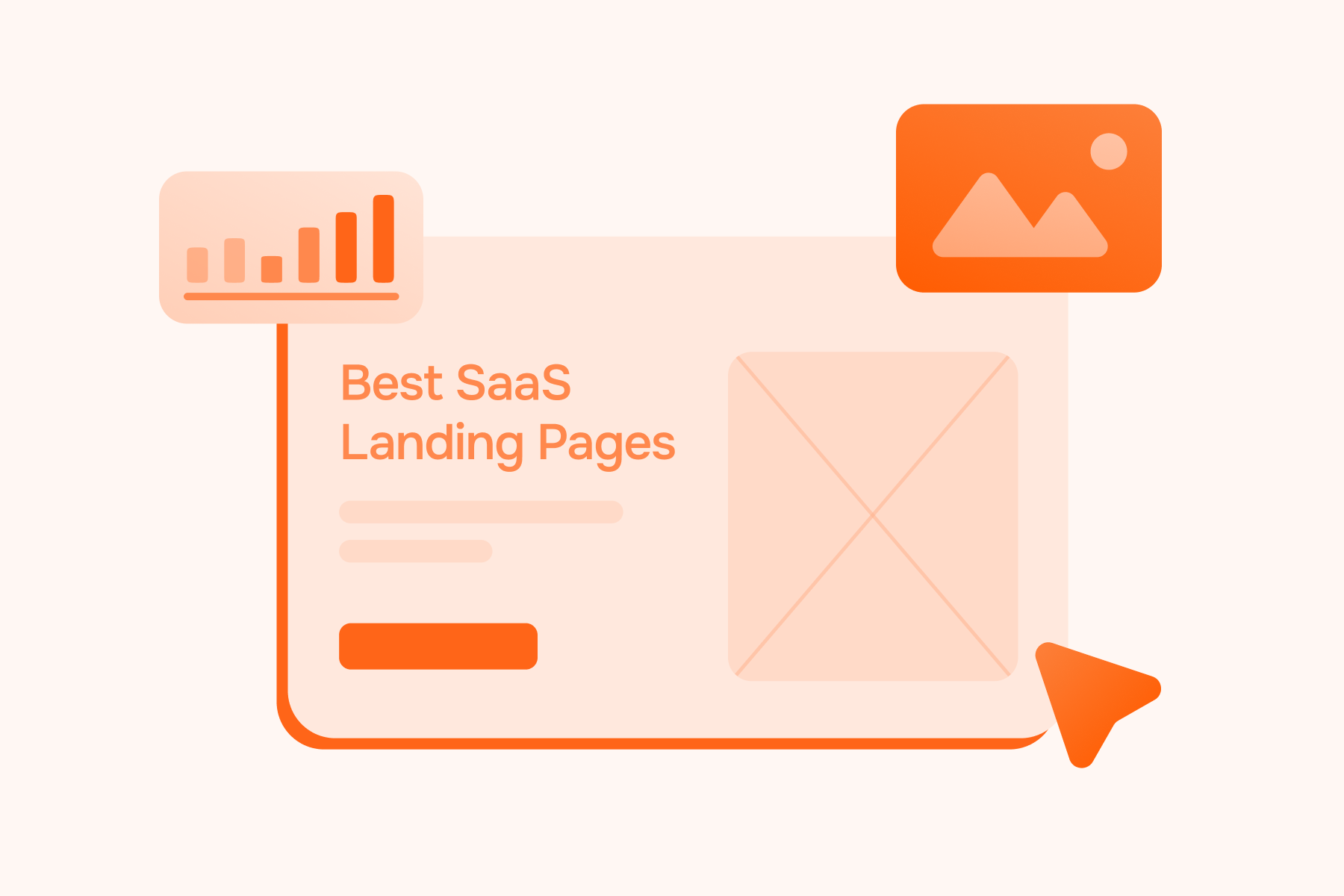
Element #3: Product Visualization That Eliminates Uncertainty
People need to see what they're buying.
This is especially true for SaaS products where the "product" is digital and intangible. We've run countless A/B tests through our CRO services, and pages with strong product visualization consistently outperform pages with abstract stock photos.
Most companies mess up by showing static screenshots. Screenshots look dated within months and don't demonstrate how the product actually works.
Successful SaaS landing pages use short product demos (15 to 30 seconds max), interactive elements that let people explore features, before and after comparisons, and annotated screenshots that point out benefits.
Make sure your product shots are current. We've audited pages where the UI screenshots were from three versions ago. That's making people wonder if you're still in buisness.
Element #4: Conversion-Focused CTA Strategy for High-Converting SaaS Landing Pages
Your primary CTA shouldn't be creative. It should be crystal clear.
"Start free trial." "Get started free." "Try it free."
These work because there's zero ambiguity. "Launch your journey" isn't helping anyone, it's just making you sound like a motivational poster nobody reads.
Primary vs. Secondary CTAs and the Psychology of Choice
Adding a secondary CTA can actually increase conversions on your primary CTA. Counterintuitive, right?
It gives people an out. Some visitors aren't ready to sign up for a free trial; they might be ready to watch a demo or download a guide. Many who click the secondary CTA end up converting later.
Primary vs. Secondary CTA Strategy:
The trick is making it obvious which action is primary: your main CTA should be big, bold, impossible to miss. We usually go with a solid button for primary and a ghost button for secondary.
Free Trial vs. Demo and Which Converts Better for Your SaaS Product
What we've learned from tracking conversion data across dozens of SaaS businesses: for simple, intuitive products, free trial CTAs convert better. People want to try it themselves.
For complex products with longer implementation times or higher price points? Demo CTAs often work better because people want to understand it before committing.
For products with a straightforward value prop but complex setup, we've had success with a hybrid; "Start free trial" as primary, "Book a demo" as secondary.
Test it. We don't guess at Aimers; we track everything through our analytics setup. Run both options for a few weeks and see what your actual audience prefers. We've covered data-driven approaches to this extensively.
Element #5: Smart Pricing Transparency Without Sending Visitors Straight to the Pricing Page
Pricing on the landing page is controversial. Some swear by it. Others hide it.
Our take? It depends on your pricing model.
When to Show Pricing on Your SaaS Landing Page
If your pricing is simple and competitive, show it. The transparency builds trust and pre-qualifies leads. People who bail when they see your pricing probably weren't going to convert anyway.
If your pricing is "contact us" or highly variable, don't shoehorn a pricing table onto your landing page. It'll just confuse people.
Instead, be transparent about the general range. "Plans starting at $49/month" or "Pricing based on number of users" gives enough context. Research from Gartner shows that B2B buyers complete 83% of their research before contacting sales, they're looking for pricing information whether you show it or not.
What works well is a pricing preview; not your full pricing page, but a simplified version showing core tiers and what they include, then a link for details. This satisfies transparency without overwhelming people.
Element #6: Benefit-Driven Copy That Resonates With Your Ideal Customer
This is where most SaaS landing pages completely fall apart.
They're written by product people who love features. "Real-time collaboration!" "Advanced analytics!" "Seamless integrations!"
Cool. But what do those features actually do for me?
The Feature-to-Benefit Translation Framework
Every feature needs to be translated into a benefit that connects to a specific pain point.
The formula we use: Feature, what it does, why that matters, the emotional payoff.
Turn Features Into Benefits That Sell:
Most SaaS landing pages stop at step one or two. Great SaaS landing page examples go all the way to step four.
People buy based on emotion and justify with logic. Your features are the logic part, but you need the emotional hook first.
Using Micro-Copy to Reduce Friction
Micro-copy is the small stuff; button text, form field labels, error messages.
But it matters way more than you'd think.
We've seen conversion rate improvements from changing a CTA from "Submit" to "Get started free", or adding reassurance copy like "No credit card required. Cancel anytime."
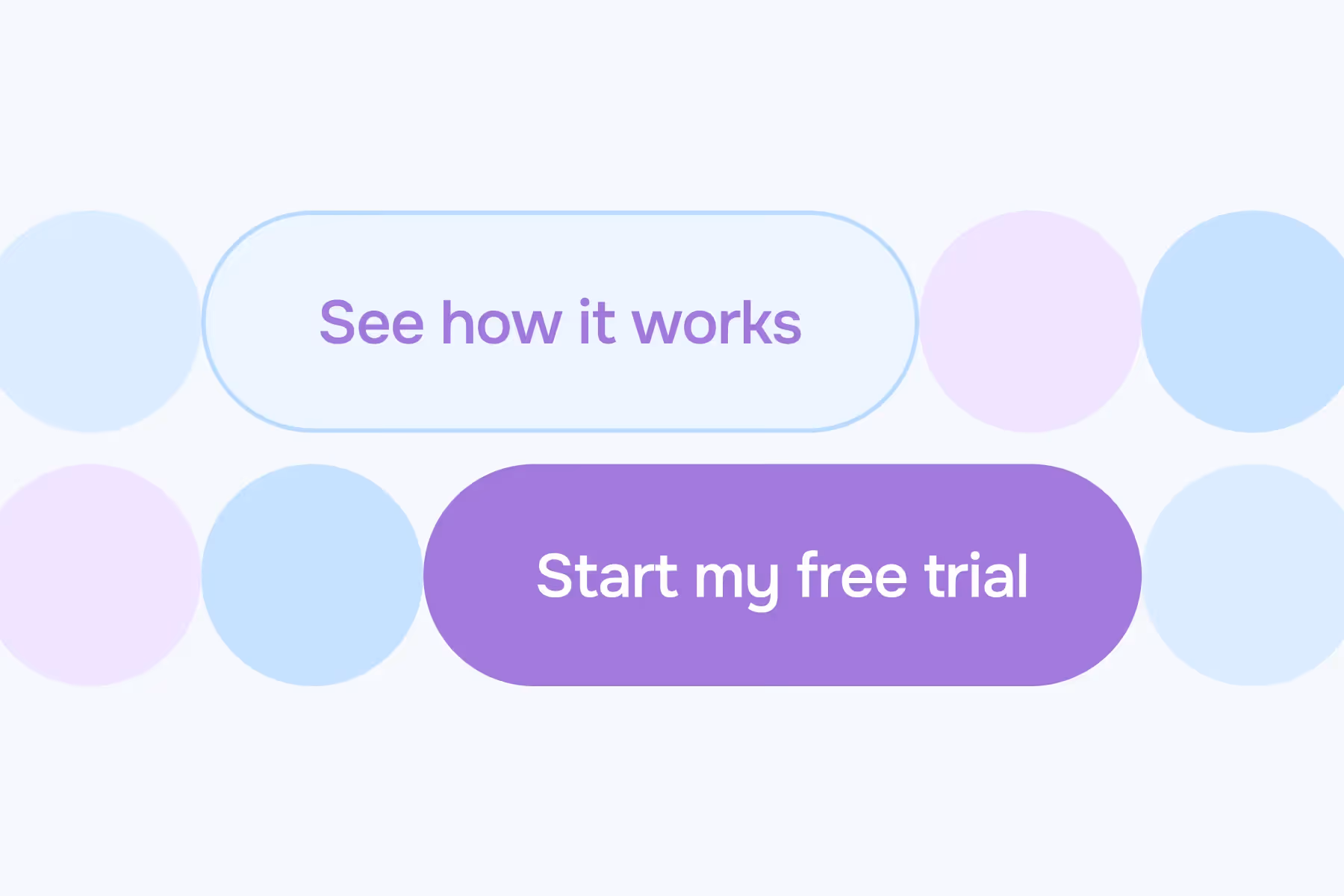
What we follow in our landing page design services: never use generic CTAs like "Submit"; always address obvious concerns; use first-person language in CTAs ("Start my free trial" vs "Start your free trial"); add helpful hints near form fields.
These tiny changes collectively lift conversions by 20% or more. It's not sexy work, but it moves the needle. We've documented 10 specific tactics you can implement today.
How Top SaaS Companies Humanize the Page
What makes a SaaS landing page feel human? Actual humans.
Photos of your team. Names of real customers. Voices of people who've benefited from your product, not stock photos of models pretending to have a business meeting.
Use conversational language, show real team members, include specific names and titles in testimonials, add a founder's note, use "we" and "you" language instead of "the platform" or "users."
Trust is built through human connection, even on a digital page.
Element #7: Frictionless Sign-Up Experience and Mobile Optimization
The actual moment of conversion. This is where SaaS landing pages snatch defeat from the jaws of victory.
Your visitor is convinced. They click the CTA.Then they hit a signup form that asks for 12 pieces of information.
Come on.
Form Field Optimization for Maximum Conversion Rate
Every additional form field reduces conversions. This isn't debatable, it's proven across hundreds of tests.
For a typical free trial, you need email, maybe name, maybe password. That's it.
.avif)
You can collect company size and use case later. A client we worked with through our CRO service reduced their signup form from eight fields to three. Conversion rate increased by 68%.
The quality was basically the same. The people serious about trying the product were going to try it either way. You stopped losing people on the fence who might have become great customers. Baymard Institute's form field research confirms that unnecesary form fields are one of the top reasons for form abandonment.
Why Every Landing Page Must Be Responsive
More than half your traffic is probably coming from mobile devices.
If your landing page isn't responsive and doesn't work flawlessly on mobile, you're throwing away half your potential customers. "Works on mobile" doesn't mean "shrinks to fit the screen." It means forms are easy to fill out on a small screen, CTAs are thumb-friendly (at least 44x44 pixels), images load fast, and the layout is actually designed for mobile.
We've seen SaaS companies spend thousands on paid social campaigns driving traffic to landing pages that are basically unusable on mobile. Even the best ad campaign can't save a broken landing page. Google's mobile-first indexing means that how your page performs on mobile directly impacts your search rankings too.
At Aimers, when we design landing pages, we start with the mobile version first. Because if it works on mobile, it'll definitely work on desktop. That first impression happens on a phone screen while they're waiting for their coffee.
Real SaaS Landing Page Examples That Get These Elements Right
Some actual examples of effective SaaS landing pages that nail these principles, not to copy blindly, but to understand what makes them work.
Best SaaS Landing Page Designs and What Makes Them Work
We're constantly analyzing great SaaS landing page designs to understand what makes them convert.
The companies getting it right lead with a clear, benefit-focused value prop; they use product visualization that shows the actual interface; they strategically place social proof throughout; they make it stupid-easy to start a trial or book a demo; and they obsess over mobile.
The companies missing the mark do feature dumps without explaining the "so what." Generic stock photos instead of product shots; testimonials with no context; confusing navigation; forms that ask for way too much information.
You don't need to reinvent the wheel. Find three to five successful SaaS landing pages in your space, analyze what they're doing well, and adapt those principles to your product. Unbounce's landing page report provides industry-specific conversion benchmarks that can help you understand where you stand.
Looking at our own case studies, we've seen this play out over and over. With Orion Labs, we increased the value of their sales opportunities from paid campaigns by 4X overall. A huge part wasn't just the ad campaigns, it was making sure the landing pages were actually doing their job.
Key Takeaways for Building a Great SaaS Landing Page That Converts
Building a perfect SaaS landing page isn't about following a checklist. It's about understanding your customer, articulating your value clearly, and removing every possible barrier to conversion.
The 7 Essential Elements of High-Converting SaaS Landing Pages
The best SaaS landing pages are never "done." They're constantly being tested, refined, and improved based on real data. Split testing your landing pages is how you find what actually works for your specific audience. VWO's A/B testing guide offers additional frameworks for testing different elements systematically.
At Aimers, we don't guess. We track everything through proper analytics. Every element is measurable; every decision is backed by data. That's how we've helped companies like Mixpanel increase leads while driving down CPL, or how we helped Originality.AI increase Google Ads sales by 100%.
If your SaaS landing page isn't converting the way you'd like, it's probably not because you need a complete redesign. It's more likely that one or two of these elements are missing or underperforming.
Start with the basics. Get your value prop crystal clear. Add strategic social proof. Refine your forms. Test different CTAs.
If you're wondering where your conversions are leaking, or if you're driving traffic from Google Ads, LinkedIn, or Facebook campaigns but not seeing the ROI you expected, chances are the issue isn't your ads. It's what happens after the click.
Want us to take a look at your landing page and show you exactly where you're losing conversions? Book a short strategy call and let's talk.
Because in 2025, "good enough" landing pages don't cut it anymore. Your competitors are refining their approach; your customers are getting pickier; and every visitor who bounces is revenue left on the table.
Time to fix that.
FAQs
What's a good conversion rate for a SaaS landing page?
How long should a SaaS landing page be?
Should I create separate landing pages for different ad campaigns?
How often should I update or test my SaaS landing page?
Do I need to hire a designer to create a high-converting landing page?
February 24, 2025
.avif)