6 Easy Ways to Start Split Testing Your Landing Pages
January 18, 2024

A high-quality landing page is the key to driving sales and nurturing customers.
However, knowing what your prospective customers want to see on your landing pages can be tricky. For example, would they prefer a long, detailed page that goes into the specifics of what you can offer them or something short, succinct, and to the point?
In this scenario, landing page split testing is the key to success. Let’s take a look at what split testing is, how to implement it, and six ways you can get started when it comes to optimizing your pages.
Want more expert tips for building landing pages your customers will love? Check out our guide to data-driven best practices!
What is Split Testing?
Split testing, or A/B testing, is a critical part of the conversion rate optimization (CRO) process.
It allows you to compare two different versions of a web page and how real-life customers respond to them. As a result, you can see which particular elements on a page lead to more conversions.
How Does Split Testing Work?
To carry out a split test, you create two virtually identical versions of a landing page – with everything the same apart from one thing. For example, each page could have a different heading.
It’s essential to test only one thing at a time. While it might be tempting to test multiple things on a page to get quicker results, this means you won’t know what specific change led to an increase or decrease in conversions.
You then direct half your customers to one page and the rest to the other. After a set period of time, you review the results and see which page got the most conversions.
This will give you a good indication of which type of heading your customers like most.
How to Implement Split Testing
44% of businesses use specialist split testing software to manage their split testing experiments.
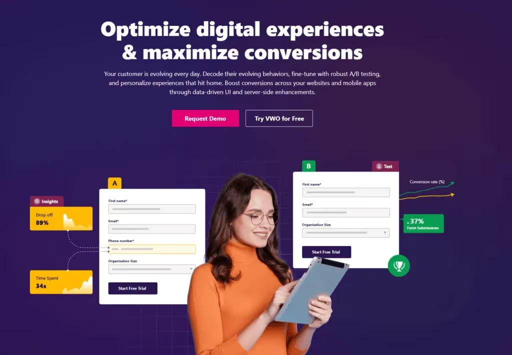
The benefit of using software like Crazy Egg, Optimizely and VWO is that you can run lots of split tests at the same time and get automated reporting. This is ideal if you have a lot of landing pages on your website you want to optimize for conversions.
However, you can manage your split testing yourself too. All you need to do is create two separate pages on your content management system of choice. Then, it’s just a case of driving traffic to each page to see what happens.
For example, you can create a paid search campaign or marketing email campaign with links to both pages. Many paid Ad, paid social, and email software providers come with split testing functionality so you can manage this efficiently.
The benefits of split testing
Did you know that 60% of businesses carry out split testing on their landing pages? If you’re not doing any testing, here are some reasons why you should.
The critical advantage of split testing is that it’s entirely data-driven. Instead of relying on assumptions or trusting your gut, you get real scientific insights into what works and what doesn’t.
Another benefit is that the results of split testing are unique to you and your business. Rather than using data and insights from other organizations that might not work for you, you get qualitative research that can help you directly increase your conversions.
You can also apply what you learn to other pages on your website, meaning you enhance the user experience. This doesn’t just mean increased conversions, but happier customers that spend more time on your site.
Finally, split testing can help you save money. As your research means you only implement strategies that will improve your conversion rates, you’re not wasting money on marketing tactics that won’t work.
6 Easy Ways to Run Split Testing on Your Landing Pages
Now that you know what split testing is, how can you use it to enhance your landing pages?
Here are six ideas to get you started!
1. Test Different Headlines
According to Copyblogger, while 80% of people will read your headline, only 20% will read the rest of your page. This makes the headline one of the most important elements of any landing page. Get your headline right, and it will inspire your visitors to keep reading, hopefully all the way through to the end.
In our experience, the best headlines are ones that are short, powerful, and explain the benefits of your product or service.
When you’ve got a handful of killer headlines, split testing will show you which ones resonate with your prospective customers the most.
2. Test Different-Sized Forms
How long should a form be? It’s hard to say. While studies advise that you should aim between three and five fields, you may need more or less depending on whom you’re targeting and what you offer.
If customers see value in what you provide, they’ll be more willing to hand over their information.
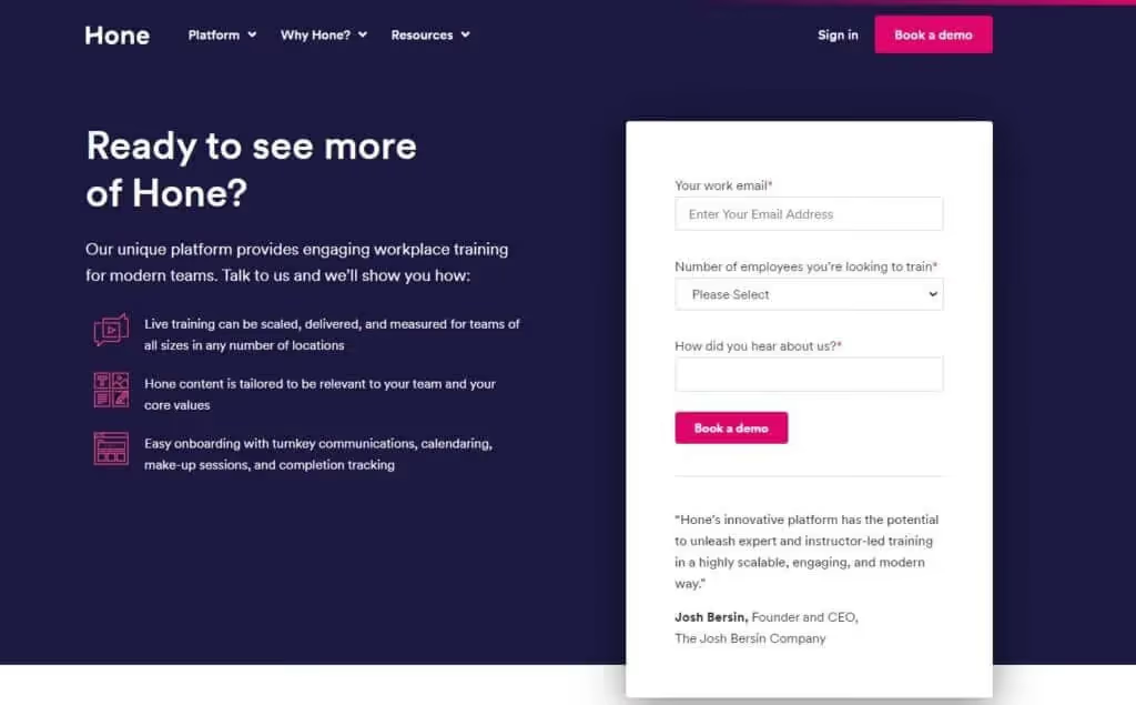
You can use split testing to identify how long your data capture forms should be before conversion rates start to drop off.
Split testing can also advise on the order you display your form fields, and how you should label them. For example, should you ask for a phone number first, or an email address?
3. Test Different Visual Content
Images and videos are essential to any good landing page. They let you get people’s attention, tell the story of your brand, and make large chunks of text easier to digest.
They also help build trust and credibility – it’s no surprise that so many landing pages showcase the logos of well-known customers!

Split testing not only lets you test different images and videos to see which ones customers like the most, but which position you should place them in.
Conversion rate optimization studies show that people are more likely to react to assets on the left-hand side of a page, but your own split testing may tell a different story!
4. Test Different Copy
The words you use and the way you use them can make a massive difference to your conversion rate.
As well as your main page headline, you can test your subheadings, testimonials, body copy and microcopy – the tiny bits of copy that show page readers what to do.
Split testing is also great for testing copy length and tone of voice. Do your potential customers respond better to casual or more formal wording?
5. Test Different Page Layouts
Your landing page consists of multiple elements. The order in which you place these elements can have a significant impact on your conversion rate.
You might place certain elements above or below the fold or combine a particular piece of copy with a specific image.
Alternatively, you might want to see whether placing a call-to-action button at the top or bottom of the page is more effective. CRO specialist Michael Aagaard carried out a study that found that a call-to-action right at the bottom of a landing page led to a 304% increase in conversions.
While this specific placement might work for some landing pages, it’s vital to run split testing on your own site to see whether it results in signups and purchases.
6. Test Different Call-to-Action Buttons

If your heading is the first thing web visitors engage with, your call-to-action is the last thing they engage with. You want it to stand out and be as enticing as possible.
There are plenty of ways you can tweak your call-to-action button to get the highest conversion rates. As well as the copy, you can change the button color, size, even whether the button has straight or rounded corners!
Here’s an interesting case study from Optimizely – the company tested different call-to-action buttons to see which led to the most donations during the Obama 2008 campaign. ‘Learn more’ led to more conversions than variations like ‘sign up’ and ‘join us now.’
The great thing about split testing call-to-action buttons is that it’s easy to do. Change the color or text, and see what your visitors think of the changes.
Alternatively… Leave the Split Testing to the Experts
Split testing is the key to building landing pages that educate, inform and most importantly, persuade prospective customers.
The key is to approach each split test scientifically. The more methodical and objective you can be, the better the results.
An additional benefit is that you can use split testing in all of your marketing, not just landing pages. You can split test email newsletters, Google search ads, social media posts… anything you want your customers to convert on!
If you don’t have the time or resources to conduct split tests, an agency that specializes in CRO can help. At Aimers, we thoroughly research your business, industry, and competitors, using the results to split test your landing pages to perfection.
Our landing page design experts provide weekly and monthly reporting so you’re always in the loop and know which changes are bringing the right results.
Want to know more? Get in touch today to see how you can reap the benefits of split testing on your website.
FAQs

February 2, 2026

February 3, 2026


.avif)

