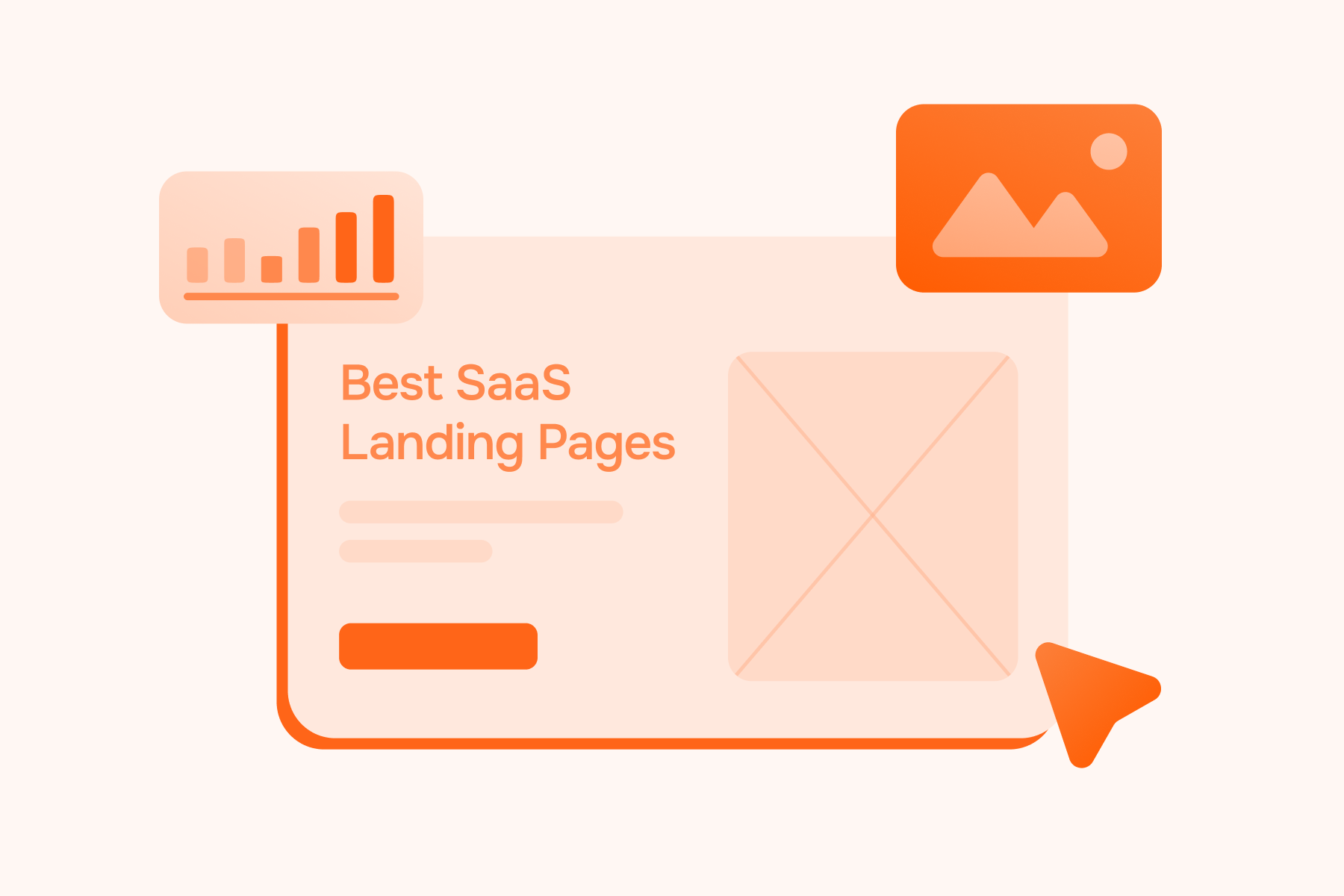
SaaS Landing Page Not Converting? It's Just a Homepage

November 19, 2025
We've seen this pattern too many times. A SaaS company drops $15K on a beautiful landing page. Stunning gradients, smooth animations, maybe even a custom illustration or two. The founder posts it on LinkedIn. Everyone loves it.
The comments roll in. "Clean design!" "Love the UI!" "This is fire 🔥"
And then... crickets.
The conversion rate sits at 1.2%. Traffic comes in, bounces right back out.
A landing page that doesn't convert isn't really a landing page. It's just a homepage with a form slapped on it. We provide full-cycle PPC management for SaaS companies every single day. Marketing rarely fails because of low traffic; the real leak is often deeper in the funnel. If your landing page doesn't convert, you're just burning money.
The Brutal Truth About Homepage vs. Landing Page Design
Most founders treat saas landing pages like mini-websites, cramming in everything about their product, adding navigation menus, linking to the blog, throwing in their entire feature list.
That's not a landing page. That's a homepage wearing a disguise.
Every SaaS Landing Page Needs a Single Job to Do
A real landing page has one mission. One goal. One very specific thing it needs the visitor to do, book a demo, start a free trial, download a resource.
The moment you add a second goal, your saas landing page conversion rate splits. Add a third? It tanks even harder. We've run enough CRO tests across our clients (companies like Mixpanel and Originality.AI) to know this isn't theory; it's math.
If someone lands on your page and you're asking them to "Start Free Trial" AND "Watch Demo" AND "Read Case Studies" AND "Check Pricing," you've basically given them permission to do nothing. Decision paralysis is real.
Your Homepage Tells Your Story, Your Landing Page Closes the Deal
Your homepage is where you tell your brand story, explain your mission, show off your team, list every feature your saas product has. Homepages are exploratory by nature.
But when someone clicks on your Google Ad or your LinkedIn campaign? They're evaluating. They came for a specific solution to a specific pain point.
We learned this years ago with an early client who had a landing page at 2.8% conversion. We stripped out the navigation, removed three CTAs, focused the entire page around one value proposition.
Conversion jumped to 7.1% in two weeks. Same traffic. Same ad spend.
Homepage vs. Landing Page: Know the Difference
What Actually Makes the Best SaaS Landing Page Examples Convert
When we analyze the best saas landing page examples out there (and trust us, we've studied hundreds), the winners share something that has nothing to do with design aesthetics.
They understand human psychology and decision-making.
People don't convert because your gradient is perfect. They convert because you've convinced them you understand their problem and can solve it. The best saas landing page designs often aren't the ones that win design awards.According to research from Unbounce analyzing over 74 million visitors, the average landing page conversion rate sits around 4-7% depending on industry, but the top performers consistently hit double digits through strategic optimization, not just visual appeal.
The Key Elements of a SaaS Landing Page That Drive Action
A clear value proposition that passes the 5-second test. If someone can't figure out what you do and why they should care in five seconds, you've already lost them. "Project managment for remote teams" beats "Reimagining collaboration in the digital workspace" every single time.
Social proof that's actually relevant. Not just any social proof; the RIGHT social proof for your audience. B2C saas landing pages? Show user testimonials, ratings, customer logos. Enterprise saas? Case studies with specific ROI metrics matter more. We increased Originality.AI's conversion rate by 210% partly by repositioning their social proof to speak directly to their target market's pain points.
A hero section that hooks immediately. Your hero section isn't there to look pretty, it's there to make someone think, "Oh, this is exactly what I need." No vague promises. No buzzword soup.
Why High-Converting SaaS Landing Pages Feel Different (And How to Spot Them)
High-converting saas landing pages feel almost uncomfortably focused. They're borderline aggressive about keeping you on track. There's white space, sure, but it's strategic; it guides your eye down the page.
The copy doesn't try to be everything to everyone. It picks one target persona and speaks directly to them. If you're building for both small businesses and enterprise, you need separate landing pages. Period.
And the CTAs? They're everywhere, but they all say the same thing. Research from Unbounce found that landing pages with a single CTA convert at 13.5%, compared to just 10.5% for pages with five or more CTAs. You're not confused about what action to take because there's only one action available.
Real SaaS Landing Page Examples That Prove Conversion Beats Beauty
We could show you a dozen beautiful landing pages right now that convert at under 2%. And we could show you some that look almost boring by comparison that convert at 12%.
The boring ones understand their customer's actual journey.
One of our clients in the analytics space had a gorgeous original landing page. Custom animations, interactive demos, the works. It converted at 1.8%. We rebuilt it focusing on one thing: addressing the specific pain point their Google Ads traffic was searching for.
Conversion hit 6.4%.
Or ShipBob. Their challenge wasn't design; it was message match. Their ads promised one thing, but their landing page tried to be comprehensive. We aligned the message, simplified the form fields, reinforced their value prop with customer success stories. Lead volume and quality both went up.
When we work on landing page design projects, we start with the ad-to-page message match before we even think about colors or layouts. Because even the best ad campaign can't save a broken landing page.
Design Inspiration Won't Save You: The Elements of a SaaS Landing Page That Actually Matter
Browsing through SaaS landing page design inspiration galleries feels productive. You bookmark 47 SaaS landing page examples thinking, "I'll take this hero section, that pricing page, these testimonials..."
But inspiration without strategy is just copying without context.
You end up with a Frankenstein landing page that looks slick but converts like garbage. Founders find a landing page they love (usually from a company ten times their size with a completely different business model), and they try to replicate it.Then they're confused when it doesn't work.
Your Value Proposition: The 5-Second Test Every Marketer Needs to Pass
We make every client do this exercise. Show your landing page to someone who's never seen it. Give them five seconds. Then hide it. Ask them what the company does.
If they can't tell you, your value proposition needs work. And no, "We help businesses grow" doesn't count, that could be literally anyone.
"Email marketing automation that doesn't require a developer," that's a value proposition. "Transform your business with AI-powered solutions," that's marketing fluff.
Social Proof That Converts (Not Just Decorates)
Companies slap customer logos at the bottom of their landing page like participation trophies. But effective social proof is contextual.
If you're selling to marketers, show testimonials from marketers. If you're selling to enterprise, show enterprise customer logos. Match the proof to the audience.
Use real testimonials. Not the sanitized, corporate-approved ones. Get the raw ones. "Before [Product], we were manually doing this for 6 hours a week. Now it takes 20 minutes." That's real. That converts.
When we helped Orion Labs scale their PPC campaigns, we repositioned their social proof to showcase the 60% increase in sales opportunities in the first 6 months, specific numbers that spoke directly to their target customers' goals.
The CTA That Gets Clicked (And the One That Gets Ignored)
"Submit." "Learn More." "Click Here."
These are CTA buttons written by people who don't actually want conversions.
Your CTA needs to tell people exactly what happens when they click. "Start Free Trial" is okay. "Start Your 14-Day Free Trial" is better. "Get Started Free, No Credit Card Required" is even better because it removes friction.
CTA button color matters way less than you think. CTA clarity matters infinitely more.
Best Saas Landing Page Design Strategies to Steal Right Now
These are strategies we implement for our clients that consistently move conversion rates up.
Form Fields: Where Most SaaS Companies Lose the Battle
Every form field you add drops your conversion rate by roughly 10-20%. Treat every field like it costs you money. Because it does.
We worked with a B2C SaaS client who had an 8-field form. Their reasoning? "We need this data for sales." But they were getting 50 leads a month.
We cut it to 3 fields, email, company, use case. Leads jumped to 180 a month.
Yes, the leads were less qualified initially. But 180 somewhat-qualified leads beats 50 highly-qualified leads when you can nurture them afterward. You can't nurture people who never converted in the first place. According to HubSpot's research on landing pages, forms with 5 or fewer fields generate 120% higher conversion rates compared to lengthy forms.
The Real Cost of Every from Field
Hero Section Design That Hooks Your Ideal Customer
Your hero section is prime real estate, and most SaaS companies waste it.
Our framework:
- Headline - Clear value proposition (what you do)
- Subheadline - Who it's for and the transformation they'll get
- Visual - Show your actual product UI or the outcome your customer wants
- CTA - One primary CTA, maximum
- Trust signal - A single line of social proof
That's it. More creates confusion.
How to Create SaaS Landing Pages That Convert Visitors Before They Bounce
The average person decides whether to stay on your page or bounce in about 3 seconds.
So how do you convert them that fast? You don't. But you convince them to keep scrolling. Most landing pages fail because they don't create a compelling reason to scroll.
Your page needs to follow a logical progression: hook them with a clear headline, expand on the promise, show social proof (they're thinking, "Does this actually work?"), handle objections, present features and benefits, create urgency, then make the ask.
Most saas landing pages jump around. They show features before proving credibility. The order matters.
SaaS Landing Page Conversion: The Metrics That Reveal What's Broken
At Aimers, we're obsessed with data. We don't guess; we track. Our analytics team works with SaaS companies to set up proper tracking so we can see exactly where things break down in the funnel.
The Conversion Rate Benchmarks Every SaaS Business Should Know
If your SaaS landing page conversion rate is under 2%, something fundamental is broken. Message mismatch, trust issues, or you're targeting the wrong audience.
Between 2-5%? Average range. Hit 5-10%? You're doing well. Over 10%? You're either incredibly good at this, or you're attracting extremely qualified traffic.
But these benchmarks don't exist in a vacuum. A B2C SaaS landing page with a free trial CTA should convert higher than an enterprise saas landing page asking for a demo. Your benchmark depends on your business model, your average deal size, and what action you're asking for.
We've seen landing pages convert at 15%+ when the offer is a free tool. But enterprise SaaS pages are asking for qualified demos. 4-6% is actually excellent. Context matters.
SaaS Landing Page Conversion Rate Reality Check
Testing Your Way to a Great SaaS Landing Page (Without Guessing)
Test one thing at a time, and only test things that could meaningfully move the needle.
Button color? Not worth your time unless you have massive traffic. But testing different value propositions, form length (5 fields vs 3 fields), social proof placement, or CTA copy? These can swing your conversion rate by 20-50% or more.
We ran a test for a client where we simply changed the headline from "The future of team collaboration" to "Slack alternative that doesn't drain your focus." Same page. Same design. Conversion went from 3.1% to 5.7%.
When we run conversion rate optimization projects, we start with an audit to identify the biggest conversion leaks first. Then we prioritize tests that could actually move revenue. The team at ConversionXL has done extensive research showing that poor A/B testing methodologies cost online retailers billions in lost revenue, which is why we follow rigorous testing protocols and always wait for statistical significance before declaring a winner.
If you want to know more about how to approach this systematically, we've covered 6 easy ways to start split testing your landing pages.
What to Test First: Priority Framework
Best Practices: Get Inspiration from Successful SaaS Landing Pages
The best landing page designs on the web share common patterns. But copying those patterns blindly is how you end up with a landing page that looks good and converts poorly.
Successful saas landing pages work because they understand THEIR specific audience, not because they followed a template.
Patterns we see consistently working: above the fold clarity, strategic use of white space, progressive disclosure (start simple, reveal complexity as they scroll), multiple CTAs (same CTA, just repeated at strategic points), benefit-driven copy, real customer success stories with specific metrics, clear visual hierarchy, and mobile-responsive design (over 40% of B2B traffic is mobile now).
Most saas landing page templates give you the structure without the strategy. You get a beautiful Figma template with all the right sections, but if you don't know WHY each section exists and WHAT it's supposed to accomplish, you're just filling in blanks.
A landing page without strategy is just a pretty homepage. Pretty doesn't close deals. You can see more examples of what actually works in our post on 8 data-driven best practices for SaaS landing pages.
B2C vs. Enterprise SaaS Landing Pages: What Changes
What matters more for conversion rates, landing page design or copy?
You need both working together. But if we had to pick one (and we've tested this extensivley), copy usually has a bigger impact than design.
We've seen beautiful landing pages with weak value propositions convert at 2%, and we've seen basic landing pages with killer copy convert at 10%+.
Design creates trust and guides attention. Copy communicates value and motivates action. But if your copy doesn't resonate with your target customer's pain points, no amount of beautiful design will save your conversion rate.
Stop Losing Money on Landing Pages That Don't Convert
We've helped companies like Mixpanel refine their paid acquisition, increased Originality.AI's Google Ads sales by 100%, helped Orion Labs increase their sales opportunities by 4X overall through PPC scale, and worked with countless other SaaS companies to turn their landing pages from pretty placeholders into actual revenue drivers.
The pattern we see? SaaS companies spend months building their product, weeks creating their website, and maybe a few hours throwing together a landing page. Then they're confused when their $10K/month ad spend generates 50 leads instead of 500.
Your landing page isn't just another page on your SaaS website. It's where your traffic either converts or vanishes. It's where your ad spend either pays off or evaporates.
If you're wondering where your ad budget is silently leaking, whether it's in your Google Ads campaigns, your LinkedIn strategy, or somewhere deeper in your conversion funnel, let's talk. We obsess over conversion data, we A/B test everything, and we've built landing pages for pretty much every type of SaaS business model out there.
No pressure, no BS. Just honest insights from a team that's been in the trenches with SaaS companies for years.
Because your product deserves a landing page that actually converts.
FAQs
What's the difference between a SaaS landing page and a homepage?
Which landing page builder is worth using for high-converting pages?
How many CTAs should a great landing page include?
What are the must-have landing page elements for B2C vs. enterprise SaaS?
How do you improve SaaS landing page conversion rates without redesigning everything?
February 24, 2025
.avif)