SaaS Landing Page Examples by Funnel Stage
August 11, 2025
Imagine: Someone just landed on your page—eyes scanning, attention flickering. Are they curious? Cautious? Ready to commit? If your message doesn’t match their mindset, you're not even in the game.
You know what kills conversions faster than a slow-loading page? Irrelevance.
In SaaS, most users don’t rush from ad to checkout. They linger, question, compare. That’s why aligning landing pages with funnel stages—Awareness, Consideration, Decision—isn’t optional. It’s essential.
At Aimers, after running PPC for over 70 SaaS brands, we’ve seen one truth play out time and time again: the landing page either multiplies your ad spend or drains it silently. Even high-intent traffic can go to waste if the page doesn't match where the user is mentally.
So let’s look at how to create pages that actually meet visitors where they are—without overwhelming or underdelivering.
Why Funnel Match Matters More Than You Think
Imagine walking into a store to browse and immediately getting pitched on financing. Weird, right?
That’s exactly what happens when a landing page isn’t aligned with the visitor’s intent.
Here’s how we break it down:
- Awareness – They sense a problem but can’t fully define it
- Consideration – They’re comparing solutions
- Decision – They’re nearly ready to act. Clarity is critical.
1. Awareness Stage
Make a Warm, Low-Commitment First Impression
This is your chance to say, “Hey, we get you”—without jumping straight into the sales pitch. Focus on helping, not selling.
Visitor Mindset:
"Something’s off. Is there a better way? Help me feel understood."
Essentials:
- A headline that speaks plainly. No jargon, no fluff
- Valuable lead magnet or content resource—right up front
- Benefit bullets that explain what’s in it for them
- Minimal form: first name + email is plenty
- Social proof that supports the content, not the product
- One clear focus. Fewer distractions means higher engagement.
A common mistake? Awareness pages cluttered with product talk. It’s rarely a traffic issue—most leaks happen deeper in the funnel.
Real SaaS Examples:
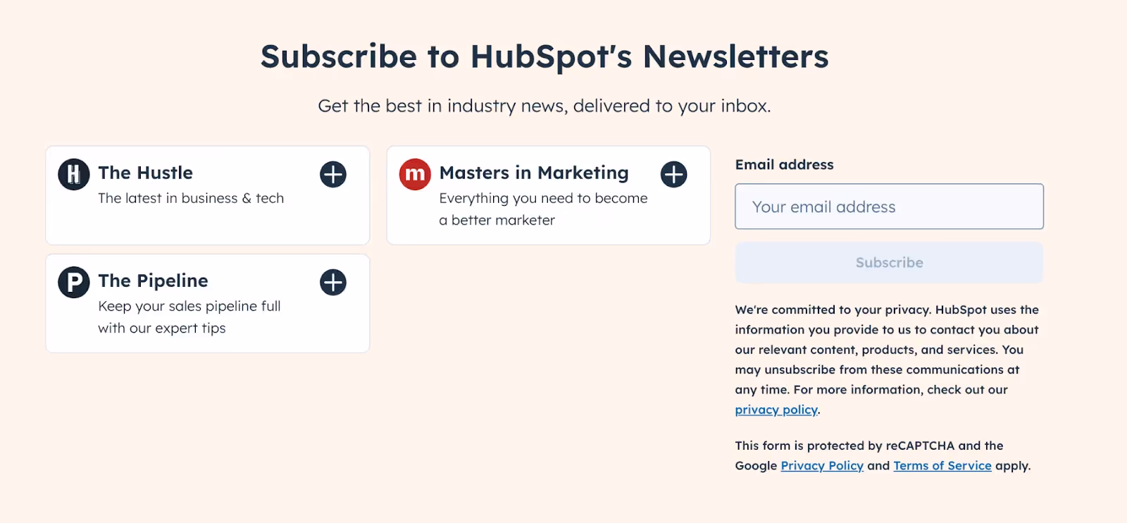
- HubSpot’s blog subscribe
“Get the best in industry news, delivered to your inbox.” Clean, no pressure.
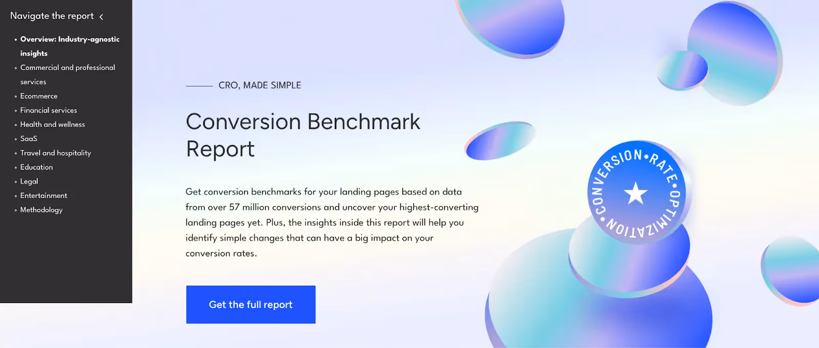
- Unbounce’s benchmark report
57M+ data points packaged as a lead magnet—pure value.
- Zapier’s webinar sign-up
“Master Google Ads for SaaS – Live Deep Dive & Expert Q&A” feels like free consulting.
At Aimers, gated content like this performs best when paired with top-of-funnel LinkedIn or Google Discovery ads. We’ve helped SaaS brands grow their email lists and brand authority through this exact approach.
2. Consideration Stage
Pages That Say “Here’s How We Actually Help”
Now they want specifics—use cases, proof, product walkthroughs.
Visitor Mindset: "So what exactly does this do? Is it for me? Can I trust these people?"
Essentials:
- Headline focused on outcomes, not features
- Simple, visual “how it works” section that maps pain to solution
- Industry-relevant testimonials or case studies
- Clear value proposition—what makes you different?
- Low-commitment CTA: “Try it,” “See demo,” “Explore features”
- Address objections head-on: security, integrations, reliability
In one campaign for Demio, we rebuilt their consideration-stage page to focus on clarity and feature relevance. The result? 41% more qualified sign-ups and a 27% drop in CPA.
→ See full case study
Real SaaS Examples:
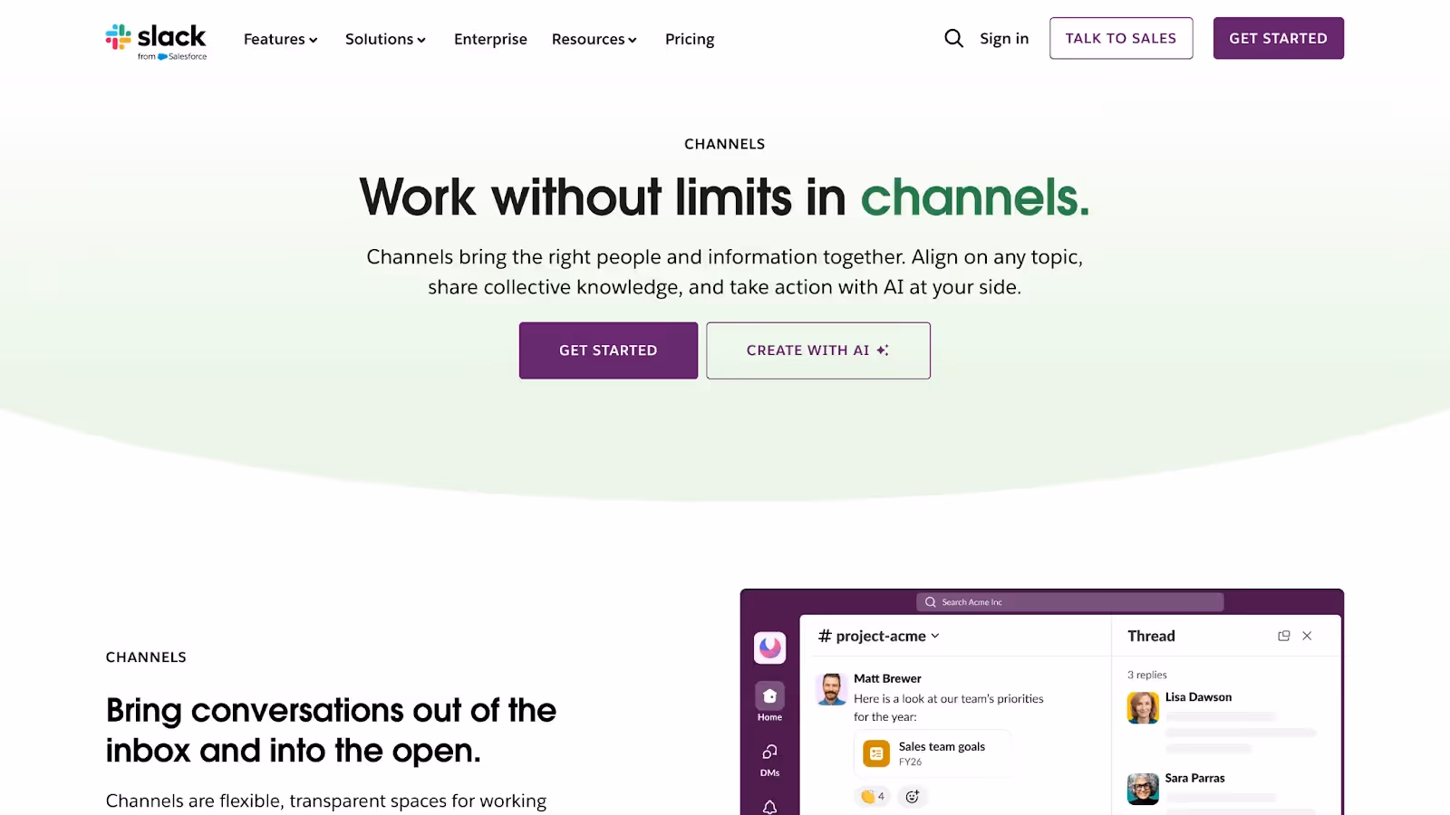
- Slack’s feature pages
Each feature solves a specific problem—clean and easy to grasp.
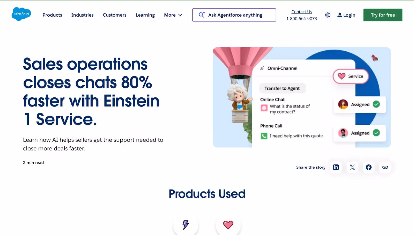
- Salesforce customer stories
Use cases with numbers.
- Mailchimp’s trial page
“Experience [Product] Free for 14 Days. Zero Credit Card Needed.”
Low friction and approachable.

At Aimers, we enhance these kinds of pages through Conversion Rate Optimization (CRO). Even minor tweaks—like tailoring testimonials to a job title—can unlock measurable results.
3. Decision Stage
Help Them Feel Confident and Ready to Take the Next Step
By now, they’re almost there. Your job is to clear the path, answer the lingering questions, and make saying “yes” feel like the easiest decision of the day.
Visitor Mindset: "How much is it? Where do I start? Can I trust this?"
Essentials:
- Direct headline: “Get Started Now,” “Pick Your Plan”
Easy-to-read pricing tables - Bold, action-focused CTAs
- Trust builders—security, support, refund info
- Short FAQs answering real concerns
- No clutter—no menus, no distractions.
Scarcity elements can work here—but only if they’re authentic.
For one of our AI SaaS clients, a revamped pricing page with clearer layout and trust signals led to a 49% drop in cost per paid user.
→ Explore the story.
Real SaaS Examples:
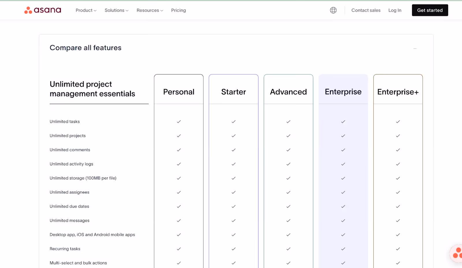
- Asana’s pricing page
Clear layout, no confusion.
- Seasonal offer blocks
“Save 20% on Annual Plans – Ends Friday.” Just enough urgency. - Calendly’s post-trial upgrade flow
Minimal steps, friction-free.
Bonus Round: Quick Fixes That Add Up
1. A/B Testing: go beyond headlines. Test by stage:
- Awareness: Lead magnet titles, form length
- Consideration: Trial vs demo CTAs, testimonial formats
- Decision: CTA copy, pricing table layout, trust icons.
2. CTA Placement:
Above the fold is a must, but add them further down too. Think of them as checkpoints.
3. Personalization:
Visitors from a niche podcast? Show them a related case study.
Returned visitors from the pricing page? Try a pre-selected plan.
This isn’t about stalking—it’s about being helpful and relevant.
Final Word: Stop Forcing One Page to Do It All
Landing pages aren’t Swiss Army knives. You wouldn’t use a chainsaw to butter toast.
Every page has a job. Treat it that way—align content and tone with where the user is. That’s when you stop pushing and start guiding.
- Awareness: Be generous
- Consideration: Back up your claims
- Decision: Remove every obstacle.
Keep testing. Keep adjusting. What worked in Q2 might flop in Q4. Funnels evolve. So do people.
If conversions are slow or leads are vanishing, the real problem may not be your ad—it might be the page they land on.
Not sure where your funnel is leaking? Reach out to Aimers. We’ll help you audit your pages, refine your strategy, and unlock better ROI from every click.
FAQs
February 24, 2025
.avif)