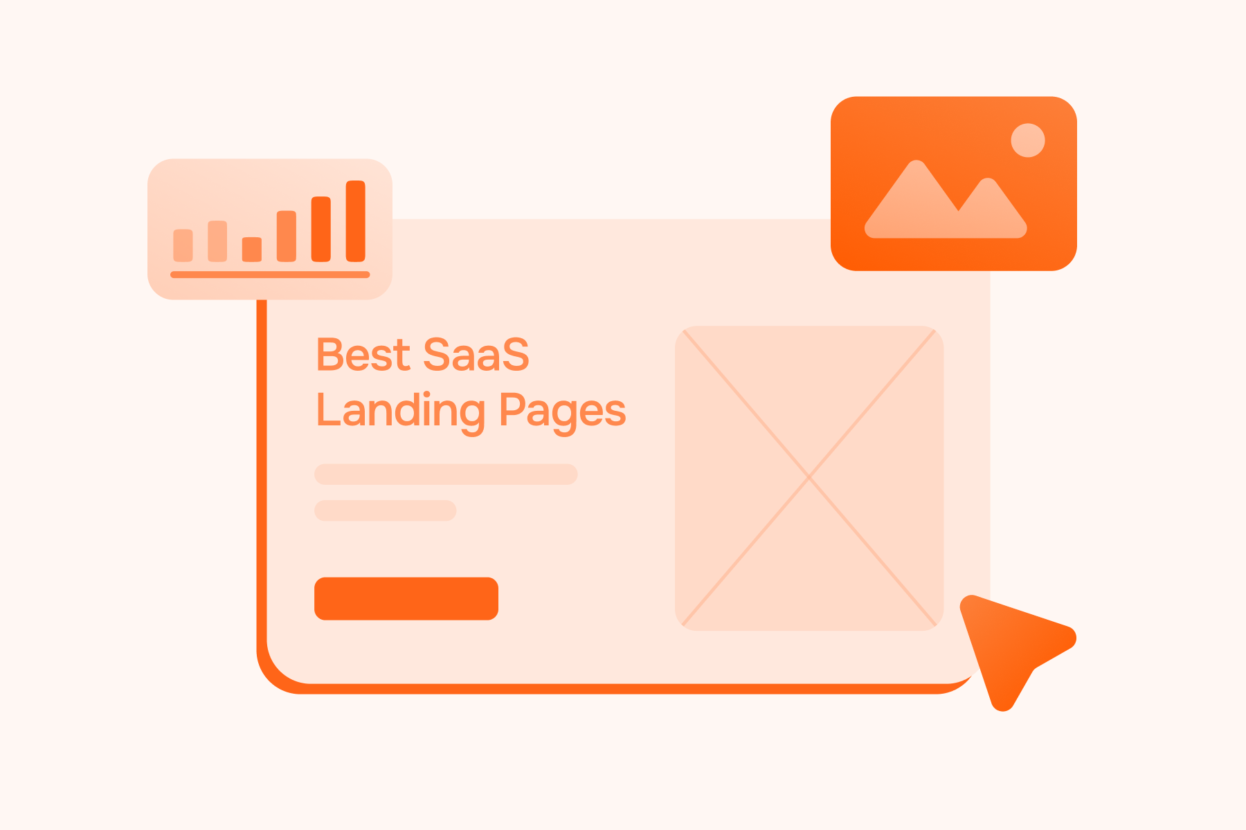
Best SaaS Landing Pages: Examples That Convert Visitors Into Leads

June 29, 2026
The best SaaS landing pages do more than present a product well. They turn a visitor’s first few seconds of attention into a clear reason to stay, evaluate, and take the next step.
That matters because SaaS pages rarely sell a simple impulse decision. A visitor may need to understand the use case, see the product in action, trust the company, compare the offer with other options, and decide whether the next step is worth their time.
For SaaS companies, that next step can be a demo request, free trial, signup, pricing page visit, template download, or sales conversation. The format changes, but the job is the same: turn attention into qualified intent.
This guide breaks down what makes a SaaS landing page convert, using real SaaS landing page examples and the principles behind them: clear positioning, product context, trust signals, low-friction CTAs, and page experiences that match buyer intent.
What Makes SaaS Landing Pages Convert
A high-converting SaaS landing page answers four questions fast: What is this? Who is it for? Why should I trust it? What should I do next?
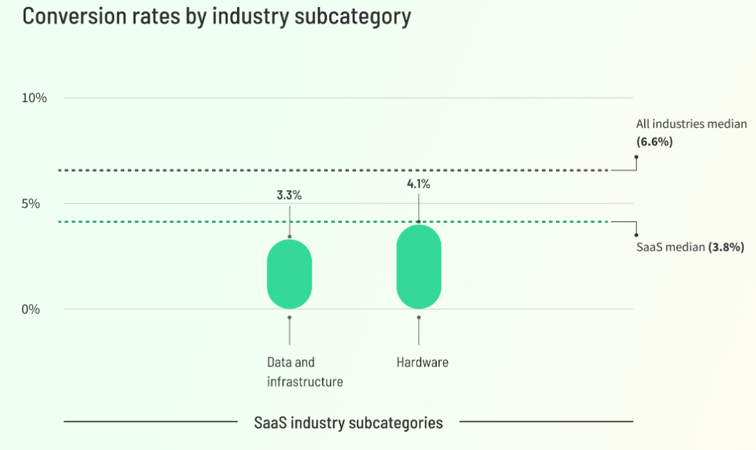
That speed matters. SaaS pages often ask visitors to understand an abstract product, evaluate the use case, trust the company, and choose a next step before they have seen the value in action. According to Unbounce, the median conversion rate for SaaS landing pages is 3.8%, below the all-industry median of 6.6%. That gap is a useful reminder: SaaS pages have to work harder to make value, proof, and intent clear.
Many pages still hide value behind vague copy, generic visuals, long forms, or asks that feel too heavy. If the hero does not explain the outcome, the rest may never get read. Nielsen Norman Group notes that users do scroll, but only when the content above the fold gives them enough reason to keep going.
Strong pages include:
- A specific value proposition above the fold
- One primary CTA, supported by a lower-friction secondary action
- Product screenshots, short demo clips, or UI previews
- Proof such as logos, customer quotes, usage numbers, reviews, or security signals
- Objection handling around price, setup, integrations, and time to value
At Aimers, we see landing page design as the point where SaaS website design, conversion strategy, paid traffic intent, and analytics come together in one user journey. A strong SaaS landing page does not just look clear. It continues the promise from the campaign, answers the buyer’s next concern, and helps turn attention into qualified intent.
Best SaaS Landing Page Examples Worth Learning From
The strongest examples show different ways to reduce buyer uncertainty: positioning, product clarity, social proof, or a clear conversion path. Use them as patterns, not copies.
1. Linear: Specific Positioning for a Specific Buyer
%20(1).jpg)
Linear is one of the cleanest SaaS website examples for precise positioning. The website narrows the category immediately: product development for teams and agents. It also shows the UI in context, so the visitor sees issues, projects, reviews, and planning instead of abstract feature claims.
What is great: Linear does not try to sell to every knowledge worker. Its hero, product visuals, and proof all reinforce one audience.
Takeaway: If your SaaS serves a narrow ICP, make the category and use case unmistakable above the fold.
2. Miro: Workflow Storytelling for a Broad Platform
.jpg)
Miro is useful because the product can support many workflows, and the LP solves that complexity with use-case sections: research, roadmaps, diagrams, and workshops. It also backs the story with scale signals, templates, integrations, and customer proof.
What is great: Miro makes a flexible platform feel practical by showing where it fits in a team's day-to-day work.
Takeaway: Broad products need workflow-based storytelling, not only a list of features.
3. Airtable: Product-Led and Sales-Led Paths on One Page
.jpg)
Airtable is one of the stronger software landing page examples for balancing two motions. The page gives users a free-start path while keeping the demo route visible for larger teams. It also combines customer logos, video, and a clear product promise around connected workflows.
What is great: Visitors can self-select without friction: try it now or talk to sales.
Takeaway: If your SaaS sells to both individuals and teams, do not force everyone into one conversion path.
4. HubSpot: Clear Navigation for a Multi-Product SaaS
.jpg)
HubSpot's get started page is helpful for companies with multiple product lines. It separates Marketing Hub, Sales Hub, Service Hub, Content Hub, Data Hub, Smart CRM, and other offers, then gives each product a relevant demo path and feature summary.
What is great: It reduces choice overload by organizing the catalog around buyer intent.
Takeaway: Multi-product SaaS pages should help visitors choose before asking them to convert.
5. Notion: Easy Start for a Broad, Horizontal Product
.jpg)
Notion knows how a horizontal product can still feel approachable. The page pairs a free-start path with a demo path, uses recognizable customer logos, and breaks the product into understandable use cases such as docs, knowledge base, projects, agents, and search.
What is great: Notion makes a large platform feel easy to enter from several angles.
Takeaway: When the product is broad, use simple entry points and familiar use cases.
6. Asana: Enterprise Trust Before the Demo
.jpg)
Asana: Enterprise Trust Before the Demo
Asana leans into credibility. The page uses recognizable customer logos, enterprise-oriented proof, demo access, and a benefit-led story around team coordination. That matters because larger buyers need reassurance before they hand over contact details.
What is great: Trust signals appear early, before the visitor reaches a form.
Takeaway: For sales-led or enterprise SaaS, proof should support the CTA, not sit far below it.
7. Figma: Simple Hero, Strong Brand, Low-Friction Start
.jpg)
Figma shows that simplicity can work when the brand and category are already familiar. The hero is direct, the free-start action is easy to find, and the page uses well-known customer logos to reinforce credibility without heavy explanation.
What is great: It lets the product category, brand trust, and free-start path do the work.
Takeaway: If your brand is strong, keep the page simple. If it is not, add more specificity and proof.
Key Elements Every High-Converting Page Needs
A conversion-focused landing page is not simply a homepage with fewer links. It is built around a specific audience, a specific intent, and a specific next step. When a page tries to explain the entire product, serve every persona, cover every use case, and appeal to every stage of the funnel at once, it usually loses focus.
The strongest SaaS landing pages make decision-making easier. They help visitors understand the value, reduce uncertainty, and move forward with confidence. That typically comes down to three core elements: clarity, product understanding, and trust.
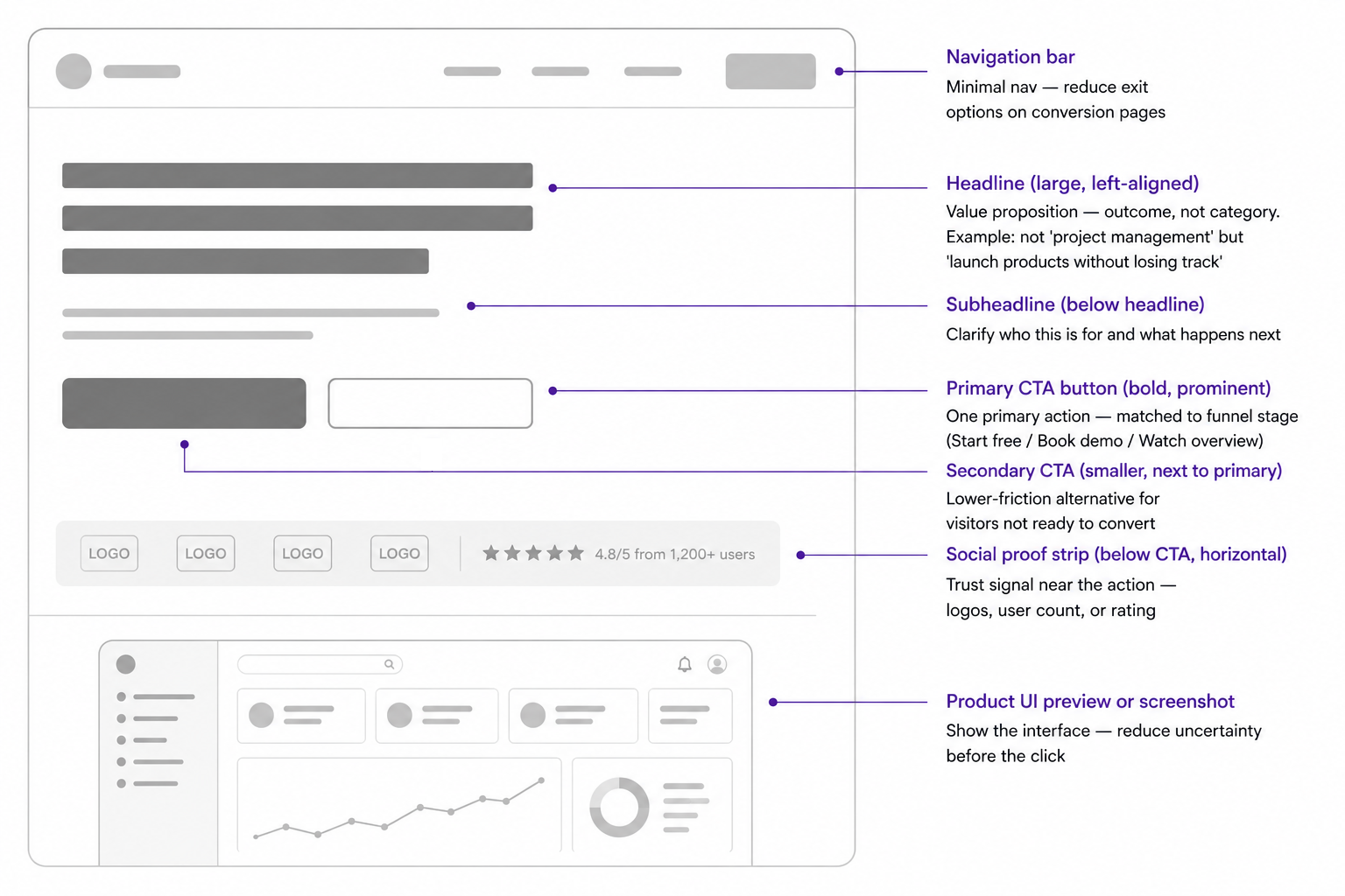
Hero Section, Headline, and Primary Action
The hero section should communicate the outcome, not just the product category. "Project management software" is a category. "Plan launches without losing ownership, approvals, and deadlines" is a value proposition.
The CTA should match funnel stage. Cold visitors may need "Watch demo" before "Talk to sales." Warm visitors may be ready for "Book a demo." PLG audiences may prefer "Start free."
Aimers' guide to critical Elements connects page structure with trust, clarity, and action.
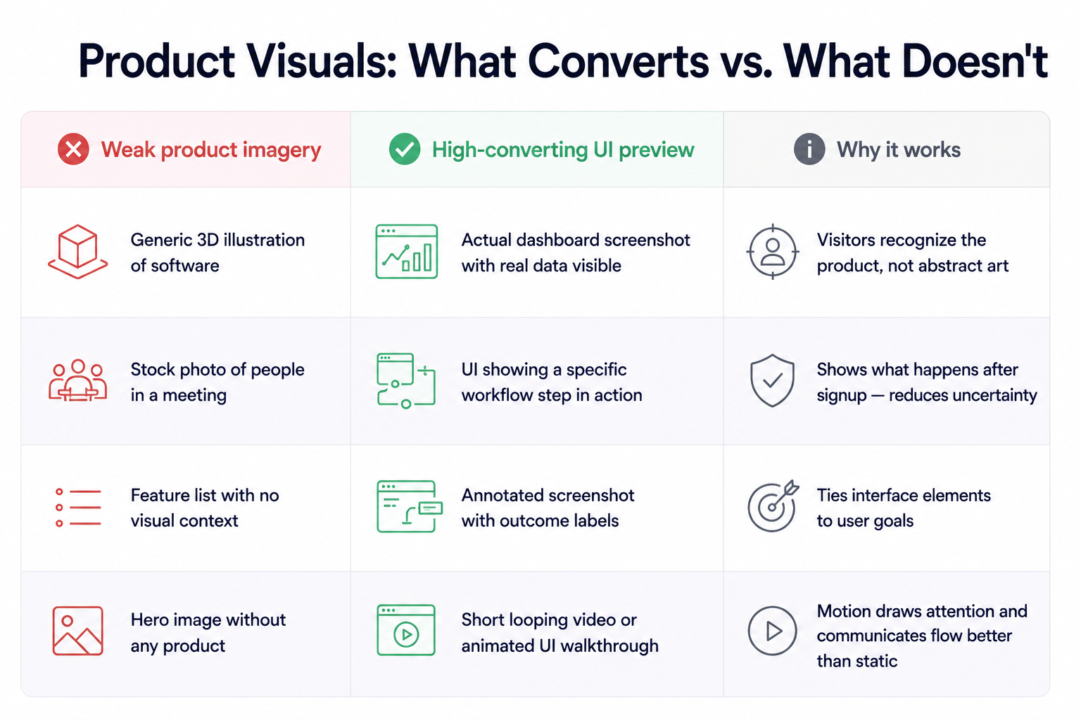
Product Screenshots, Demo Videos, and UI Previews
SaaS is intangible until the visitor sees the interface. Product visuals reduce uncertainty by showing what happens after the click. The best websites use screenshots with context.
For analytics software, show the decision the user can make. For workflow automation, show the trigger, action, and result. For collaboration software, show the shared workspace and handoff.
Social Proof, Trust Signals, and Objection Handling
Trust signals should match buyer risk. Startups may rely on reviews. Enterprise SaaS visitors often need security, compliance, integrations, customer logos, and implementation support.
The best SaaS website design examples introduce trust near the hero, reinforce it near the form, and use customer stories when visitors evaluate risk.
SaaS Landing Page Templates vs Custom Landing Page Design
SaaS landing page templates can help when the offer is simple, traffic volume is low, or a team needs to test a message quickly.
But templates become limiting when the page needs to support multiple personas, sales motions, pricing models, or use cases. At that point, custom UX matters because the page must match the buyer journey, not just fit a ready-made layout.
A good rule: use templates for early message testing, but invest in custom design when paid traffic, demo quality, enterprise deals, or conversion rate affect revenue. Aimers' list of SaaS website design agencies shows what specialist partners bring to this process.
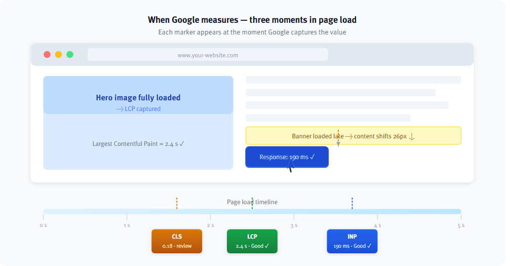
Technical performance also matters. Slow pages, layout shifts, delayed interactions, broken mobile forms, and unclear tracking can reduce conversion. Google’s Core Web Vitals framework helps evaluate the page experience through loading performance, visual stability, and responsiveness. Research from Google and Deloitte also found that even a 0.1-second improvement in site speed can have a measurable impact on conversion rates and user engagement. For paid traffic, where every click has a cost, page performance becomes part of the conversion strategy rather than a purely technical concern.
If you create landing pages for ads, the post-click experience must match the campaign promise and load quickly.
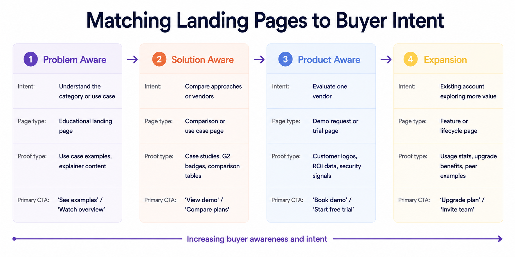
How to Match SaaS Landing Pages to Buyer Intent and Funnel Stage
Not every conversion asset should ask for the same action. The right CTA depends on intent.
Sales-led SaaS needs demo pages with qualification, proof, and sales context. Product-led SaaS needs signup flows with low friction. Paid campaign pages need message match with the ad, keyword, and audience segment.
How to Measure and Improve SaaS Landing Page Performance
Conversion rate matters, but a page with fewer leads and higher demo attendance or pipeline value may perform better.
Review heatmaps, scroll depth, recordings, A/B testing, CRM attribution, and campaign data together. Performance improves when the website matches intent, explains value faster, and removes doubts.
Final Thoughts
The best SaaS landing pages are not just attractive pages. They are focused conversion systems. They combine clear positioning, useful product visuals, relevant proof, fast performance, and actions that match user intent.
The examples covered in this article reveal a common pattern. The best landing pages do not try to explain everything about the product at once. Instead, they help visitors quickly understand why the product matters to them and what they should do next:
- Linear focuses on clear positioning
- Miro and Airtable make complex products easier to understand
- HubSpot reduces decision friction
- Notion and Figma make getting started feel simple
- Asana reinforces trust at the moment of decision
Conversion rate alone does not always reflect landing page quality. For SaaS companies, other metrics often matter just as much: demo attendance, qualified lead rate, pipeline contribution, lead response time, and revenue impact. A page may generate fewer conversions while still producing more opportunities and a stronger pipeline.
If a landing page attracts traffic but fails to turn that traffic into qualified demand, the problem is usually not design alone. More often, it comes down to fundamentals such as message clarity, lack of trust, poor alignment with buyer intent, a weak post-click experience, or gaps in tracking and attribution.
That is why there is no universal formula for optimizing SaaS landing pages. The goal is not to copy a specific layout or follow a fixed checklist. It is to continuously improve every interaction, from the first click to the final form submission, so the right visitor can make the right decision with less friction.
Ready to Improve Your SaaS Landing Page Performance?
If your SaaS landing pages attract traffic but fail to generate enough qualified pipeline, the problem may not be traffic volume. In many cases, the real issue is message clarity, offer fit, product presentation, form friction, tracking, or a weak post-click experience.
At Aimers, we help SaaS and tech companies improve landing page performance through CRO, UX, messaging, analytics, and paid traffic alignment. Our goal is not just to increase conversions, but to help turn more of the right visitors into qualified opportunities and revenue.
If you want to identify what is holding your landing pages back, let's talk.
FAQs
What are the best SaaS landing pages?
What should a SaaS landing page include?
Are SaaS landing page templates enough?
What metrics should SaaS teams track?
How do I know if my SaaS landing page needs improvement?
February 24, 2025
.avif)