Landing Page Best Practices for High-Converting SaaS Pages

May 4, 2026

If you've been in SaaS long enough, you've watched this play out. Traffic's coming in, ads are running, the product is solid. But conversions? Flat. So the team doubles spend, tests a new audience, suggests a rebrand. Nothing moves.
The page is the problem. Almost always.
We've audited hundreds of SaaS landing pages at Aimers, and the pattern is embarrassingly consistent. Companies pour money into acquisition and nearly nothing into the page that's supposed to convert it. Our analysis of 200+ pages found 73% had at least three serious conversion blockers. Average improvement after fixing them? 127% increase in conversion rates. Not from a creative overhaul. From fixing things that were just... wrong.
If you're serious about how to make a good landing page that actually pulls its weight, the answer isn't more traffic. It's fixing what's already there. That's it. Full stop.
What a Landing Page Actually Does
A landing page has one job. Unlike a homepage, which nudges visitors in a dozen directions, a landing page is built around a single action: start a trial, book a demo, download something. Every element either supports that action or shouldn't be there. Think of it like a funnel made of paper, one hole and the whole thing leaks.

Most SaaS landing pages get built like homepages with the navigation stripped out. That's not how it works, and it shows in the numbers. If you're still weighing the landing page vs website question for your paid traffic, our breakdown on landing page vs website for ads covers the tradeoffs without hedging the answer.
The Numbers That Should Make You Uncomfortable
Let's use real math. $50K a month on paid acquisition. Your page converting at 2% instead of 4%. That's $25,000 gone every single month. $300,000 a year. Not from bad targeting, not from weak creative. From a broken page that nobody's looked at properly. Nobody. For months, sometimes years.
The downstream damage is worse, too. Low-quality leads slip through. Your sales team gets frustrated and starts blaming marketing. CAC climbs without an obvious explanation. The whole funnel gets contaminated by a problem that started right at the top, and everyone's looking at the wrong thing.
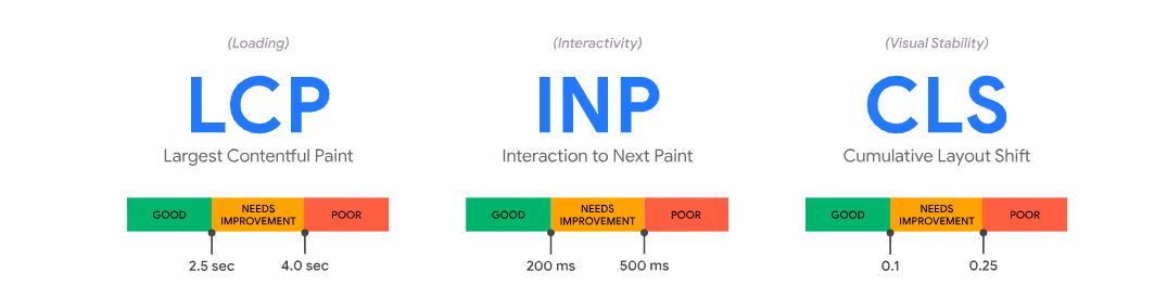
Improving conversion rates on landing pages isn't some nice-to-have side project you'll get to eventually. Research from Google's web performance team shows that a single-second delay in load time alone reduces conversions by up to 7%. Pages bleed money in more ways than most teams actually track. It's death by a thousand paper cuts, honestly.
Know Who You're Actually Talking To
Before wireframes. Before copy. Before anyone picks a button color. Figure out who this page is for. Seriously, write it down. Stick it on the wall if you have to.
A landing page design aimed at a VP of Engineering at a Series B company looks completely different from one aimed at a solo founder hunting for their first tool. Different fears, different proof they need, different language that earns trust. HubSpot's research found that companies with 10 to 15 landing pages generate 55% more leads than those running fewer than ten. More targeted pages mean more relevance. More relevance means fewer people bouncing before they've read anything useful. It really is that direct.
These are the kinds of landing page recommendations that sound obvious until you look at how many SaaS companies are still running one generic page for every audience they serve. If you want to go deeper on what those pages should actually contain, the guide on 7 critical SaaS landing page elements that convert is worth reading alongside this one.
Your Headline Is Working Harder Than You Realize
People read headlines. They skim everything else. And if the headline doesn't land, nothing else gets a chance.
So your headline needs to carry the whole argument in ten words or fewer. Following best practices for landing page design, the difference between a weak headline and a strong one isn't cleverness - it's specificity. "Manage your projects" tells me nothing. "Ship features 40% faster" tells me exactly what I'm walking away with. Outcome-driven headlines outperform feature-first ones almost without exception, and plain descriptive headlines beat clever ones about 88% of the time. Allow me to explain why: visitors aren't there to appreciate your wit. They're there to solve a problem. Meet them at the problem.
Your hero section needs to answer three questions before the visitor even realizes they had them:
- What is this product?
- Why does it matter to me?
- What do I do next?
Eight seconds. That's the window. Among the core landing pages best practices, getting this section right matters more than almost anything else on the page. Everything else is just supporting cast.
Speed Is a Conversion Problem Dressed Up as a Technical One
Nearly half of all landing pages take six to ten seconds to load. Some crawl past 20 seconds. By the time a slow page finishes rendering, a real chunk of your traffic has already left, found a competitor, and started a trial there. You paid for those clicks. They converted somewhere else.
It's not glamorous work, compressing images, enabling lazy loading, cutting render-blocking scripts. Nobody gets excited about it in the Monday standup. But it pays off fast and compounds over time. Consistent landing page optimization best practices around performance mean Google's Core Web Vitals work for you rather than against you. A page that fails those scores is working against you across multiple channels simultaneously. Paid, organic, everything.
Trust Signals That Actually Earn Trust
Two-thirds of buyers say a trust signal increases their likelihood of purchasing, according to Trustpilot. That's a lot of people who needed a nudge you could've given them but didn't. Most SaaS companies use trust signals as decoration rather than strategy, which is a waste. This is one of the more underrated best practices for landing pages, and the gap between teams that get it right and teams that don't is genuinely wide.
Generic testimonials ("Really helped our workflows!") do almost nothing. You know what does? Outcome-specific proof. The testimonials that work follow a simple three-part structure: what the situation was before, what the product changed, and what got measurably better. "Reduced deployment time from 6 hours to 20 minutes" is credible. A vague compliment is forgotten before the page even finishes loading.
Usage statistics often outperform testimonials for B2B audiences, too. "2.3M tasks completed this month" is challenging to argue with. Buyers know you curated your quotes; they trust raw numbers more. BrightLocal's consumer research consistently shows that specificity is what separates proof that converts from proof that's just there for decoration.
Getting the CTA Right
Everyone obsesses over button color. You'd think from the number of blog posts written about it that color is the variable that separates winning pages from losing ones. It's not. The real variables are placement, copy, and how many CTAs you're running.
Among the best practices landing page experts keep coming back to: multiple competing CTAs on a single page can reduce conversion rates by up to 266%. Decision paralysis, working exactly as predicted. Pick one primary action. Repeat it if the page is long, but keep it the same action every time. Always the same one.
What does work is matching CTAs to where the visitor actually is in their thinking:
First-person pronouns in CTA copy also consistently test better. "Get my personalized demo" outperforms "Get your personalized demo." Small thing. Repeatable result. When we built and optimized the landing page for Now Press Play, a single well-placed hero CTA on mobile drove a 21.5% average click-through rate over three months and generated 685 leads from the campaign. The page didn't do anything exotic. It just gave visitors one clear thing to do and made that thing easy to find. That's it.
As their marketing manager put it: "Aimers has delivered leads and sign-ups at a low cost per lead. Their knowledge of audience segmentation and algorithm understanding is impressive." Sam Cartwright, Marketing Manager
Forms Are Where Qualified Leads Go to Die
We've seen demo request pages with 12 required fields. Company size, current budget, implementation timeline, primary use case, all before anyone has spoken to a human, all before the prospect has any real reason to trust you with that information.
People leave. Every time. Honestly, you'd leave too.
Keeping forms short is one of the foundational lead gen landing page best practices that gets ignored most often. Three to five fields is a reasonable starting point, field count matters less than perceived value. If someone understands what they're getting in return, they'll fill out more. The friction isn't the number of fields. It's the absence of a clear reason to keep going. Fix the value gap, and the form length stops being a crisis.
Progressive profiling helps here too: capture the email first, gather more context through the onboarding or demo process. The prospect is warmer by then. Much better moment to ask.
What to Actually Test
Most A/B testing in SaaS focuses on button colors. This is a bit like rearranging deck chairs, it feels productive, looks purposeful, and changes almost nothing that matters.
Landing page conversion best practices point consistently in the same direction: the tests that move results are about messaging, structure, and value framing, not decoration. Here's where the real gains tend to live:
When we worked with Mixpanel on their paid acquisition, headline variations focused on specific outcomes outperformed generic feature messaging by 67%. From one variable. Not a redesign, not a new campaign, not a bigger budget. One variable. CXL's landing page research consistently points to the same conclusion: messaging tests move the needle far more than visual ones. Worth keeping in mind every time someone in a meeting suggests "trying a different shade of blue."
For a detailed look at how to improve landing page conversion for SaaS, the guide on improving your landing page conversion rate covers the approach without getting too abstract about it.
Heatmaps Tell Stories That Analytics Miss
Session recordings are uncomfortable to watch. You'll see someone spend three minutes trying to figure out what your product does because the hero section is too vague. You'll see them click on things that aren't clickable, scroll back up twice, then leave without converting. It's painful. It's also exactly what you need to see.
Scroll depth drop-offs show where the real friction lives. When 78% of visitors leave at the same spot, that spot has a problem, and no amount of ad spend optimization is going to fix it. Landing page optimization tools like Microsoft Clarity are free, take about 20 minutes to set up, and give you both heatmaps and session recordings without eating into your tool budget. Most teams have access to something like this. Far fewer actually act on what it shows.
Match the Page to Where the Traffic Came From
A visitor clicking from a LinkedIn ad is in research mode, probably comparing three options, building a shortlist for a procurement conversation. Someone who typed a pain-point query into Google is probably close to deciding. Facebook traffic might not know your product category exists yet.
Same page, same copy, for all three? That's a lot of lost relevance. Marketing landing page best practices are clear on this: the most effective SaaS teams either build audience-specific pages or adjust hero messaging based on traffic source. It's more work upfront, and it's also one of the more reliable ways to improve landing page conversion rate without touching ad spend. This is also where working with a landing page design agency that understands paid traffic makes a genuine difference, since the design choices that work for organic visitors don't always translate to cold paid audiences.
The Mistakes We Fix in Almost Every Audit
When it comes to best landing pages for conversion, there's rarely one magic ingredient. It's usually a stack of fixable problems that compound on each other, quietly:
Landing pages design best practices don't require a full redesign to apply. Most of these fixes take days, not months. And the impact shows up fast.
A Note on Tools
The platform you choose shapes what's even possible to test. Some tools make A/B testing a ten-minute job; others make it a quarterly project. Our roundup of landing page tools and builders covers what's worked across different team sizes, so you're not flying blind on that decision.
And if handling all of this in-house is no longer the right call, the guide on how to hire a digital marketing agency covers what to actually look for beyond a polished pitch deck and some impressive-looking case study thumbnails.
Your Page Is Costing You More Than You Think
We've worked with SaaS companies from early-stage startups all the way through to Series B teams with serious acquisition budgets. The same issues come up every time. Not because these teams aren't good at marketing, but because improving conversion rates on landing pages requires a different lens than building product or running campaigns.
As a Digital Marketing Agency for SaaS, we've seen what works across enough clients, industries, and budget levels to know that broken landing pages are almost never a creative problem. They're a strategy problem. Our conversion rate optimisation services are built specifically for SaaS: we audit what's broken, test what could perform better, and fix what's keeping your traffic from converting. If you want to know exactly where your page is losing visitors right now, let's take a look together.
FAQs
How long should a SaaS landing page be?
What's the biggest mistake SaaS companies make with landing page design?
Should SaaS landing pages include pricing?
How often should we run A/B tests?
What makes social proof actually work on a landing page?
February 24, 2025
.avif)