Landing Page vs Website for Ads: Which One Actually Works?

September 10, 2025

You've crafted what seems like the perfect ad campaign. The clicks are pouring in, your traffic dashboard shows promising numbers, and for a brief moment, you're convinced you've cracked the code.
Then you check your conversion metrics. The silence is deafening.
People are clicking your ads, sure. But demo requests? Trial signups? Actual paying customers? They're practically non-existent. Your bounce rate looks like a basketball score, and people are spending less time on your site than it takes to microwave leftover pizza.
Meanwhile, your website is gorgeous. We bet you spent weeks getting the design just right, organizing everything into neat sections, maybe even hired someone to write that copy. From a branding perspective, it's solid. But for converting paid traffic? It's about as useful as a screen door on a submarin.
When Your Beautiful Website Becomes a Conversion Black Hole
Think about the last time you clicked an ad. Not the one you accidentally tapped while scrolling through Instagram, the one you actually wanted to click. Maybe it promised a free trial, or a discount, or claimed it could solve that problem that's been driving you insane for months.
You clicked because that promise spoke to you in that exact moment. You weren't in research mode. You weren't comparison shopping. You definitely weren't interested in learning about the company's mission statement or reading their latest blog post about "5 Marketing Trends to Watch in 2025".
You wanted one thing. Fast.
This is where most websites completely blow it. They're designed like digital brochures, trying to tell every visitor everything about everything. But paid traffic isn't browsing. They're on a mission.
Too Many Choices — No Obvious Next Step
Your homepage probably has seven navigation items. Three different call-to-action buttons fighting for attention. Product features scattered everywhere. A headline that somehow manages to say nothing while using a lot of words.

For someone who found you organically? Fine. They've got time to figure out what you actually do.
But paid traffic is different. These people already said "yes" by clicking your ad. They're primed to take action if you'd just tell them what action to take. Instead, you're presenting them with more options than a Cheesecake Factory menu. And we all know how that ends.(Spoiler: it ends with them leaving without ordering anything.)
We regularly audit campaigns where companies are proud of having multiple CTAs above the fold. "Look, we're giving people choices!" they say. What they don't realize is those choices are murdering their conversion rates. Three competing CTAs often perform worse than one clear, obvious next step.
One of our team observations that consistently proves true: "Marketing rarely fails because of low traffic. The real leak is usually deeper in the funnel." And that leak? It's usually choice overload.
The ad’s promise isn’t obvious enough (weak message match)
This might be the most frustrating thing we see. Your Google ad promises "Free SEO audit in 24 hours." Crystal clear, right? But then people land on your homepage and the headline is something like "Comprehensive Digital Marketing Solutions for Growing Businesses Since 2019."
Where's the audit? Where's the 24-hour promise?
Visitors spend maybe four seconds looking for what they came for. Don't see it? Gone. Probably to click on your competitor's ad the one that actually delivers on its promise instead of doing a bait-and-switch.
Generic Copy That Appeals to Nobody
"We help companies of all sizes streamline their operations."
Sigh.
We've seen this exact sentence (or some variation) on most likely a thousand B2B websites. It means nothing. "Companies of all sizes" is code for "we have no idea who our customer actually is."
A bootstrapped startup founder working 80-hour weeks doesn't think of themselves as "a company of all sizes." They think "I'm drowning in manual tasks and my competitors are probably automating everything while I'm still doing data entry at midnight."
That's specific. That creates emotional connection. Generic corporate speak creates nothing.
Forms That Look Like Job Applications
First name, last name, email, phone, company, company size, budget, current tools, "tell us about your needs..."
That's nine fields for someone who just wanted to download a template.
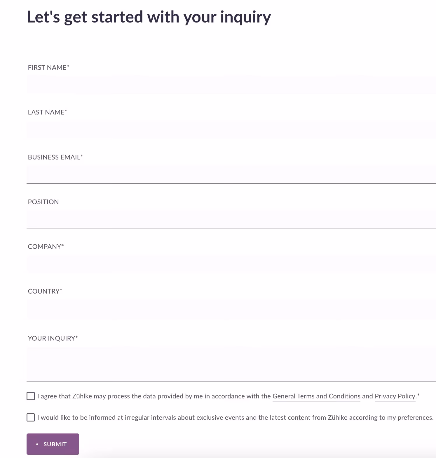
Then after they fill out your digital mortgage application, what happens? Most forms just say "Submit" with zero indication of what comes next. Will someone call? Email? Show up at their office with a fruit basket?
The uncertainty creates friction exactly when you need momentum. It's like asking someone to jump across a gap without telling them how wide it is.
Result? People start your form, realize it's longer than a CVS reciept, wonder what they're signing up for, and bail. Your form analytics probably look like a car accident brutal drop-off rates that hurt to look at.
Landing Pages That Actually Work
A landing page isn't your website with fewer pages. It's built with a completely different philosophy: one campaign, one promise, one action.
If your website is a Swiss Army knife, a landing page is a scalpel. Sometimes you need one tool that does exactly what you need it to do.
Single Focus (Revolutionary Concept)
When someone hits a proper landing page, there's zero confusion about what should happen next.

You see the ad promise repeated clearly. Quick value explanation. One primary button. No navigation menu. No sidebar distractions. No "while you're here, check out our blog" nonsense.
This isn't about being restrictive. It's about respecting the fact that someone just told you exactly what they wanted by clicking your ad. Help them get it instead of trying to upsell them on stuff they didn't ask for.
Promise Keeping (Apparently Rare)
Your headline and subhead should match your ad so closely that visitors immediately think "Yes, this is exactly what I clicked for."
If your LinkedIn ad said "Double your website traffic in 60 days," don't suddenly switch to "Comprehensive Growth Marketing Services." That's like promising chocolate chip cookies and handing someone a granola bar. Technically food, entirely wrong vibe.
Audience-Specific Everything
Instead of one page for everyone from college kids to Fortune 500 CEOs, create specific experiences.
Startup founders get copy about scaling fast while burning through runway. Enterprise buyers get ROI calculations and compliance talk. Agency owners get white-label options and client retention strategies.
A 25-year-old founder and a 45-year-old VP live in different worlds. Different priorities, different languages, different approval processes. When your copy speaks their specific language, conversion rates jump. It's the difference between hearing your name in a crowd versus background noise.
Trust Where Doubt Lives
Most websites put testimonials at the bottom where nobody scrolls. But doubt doesn't wait until the end, it happens right next to your CTA.

Smart placement: client logos near the button, testimonial above the form, security badges next to submit.
And be specific. Instead of "Trusted by 10,000+ companies," try "Used by teams at Shopify, Basecamp, and 847 other SaaS companies." Specificity feels real. Round numbers feel made up.
Forms That Don't Scare People Away
Three fields: name, email, maybe company. That's it for most B2B offers.

But field count is only half the battle. Set expectations clearly. Instead of "Submit," try "Book My Demo" or "Send My Audit." Near the form, spell out what happens: "We'll email within 24 hours to schedule your 15-minute consultation. No sales pressure."
People will share contact info when they know what they're getting and what to expect.
Five Questions to Figure Out If You Need Landing Pages
Three or more "yes" answers? You need dedicated landing pages yesterday.
Are you sending ads to your homepage?
Yes? Stop. You're mixing goals and killing conversions.
Homepages are for exploration. Landing pages are for conversion. Sending high-intent traffic to browse-mode pages works against human psychology.
Multiple CTAs above the fold?
Yes? Every extra option kills action likelihood.
We've seen this across hundreds of Google Ads and Facebook campaigns. When we help clients focus on one clear action, conversions typically improve 40-60%. The magic isn't design. It's psychology.
Does your headline ignore the ad promise?
Yes? This probably costs more conversions than anything else.
Disconnect between click and landing = immediate bounce. It's like ordering pizza and getting Chinese food delivered. Might be good, but it's not what you ordered.
Same page for different audiences?
Yes? Generic messaging creates zero emotional connection.
A startup founder and enterprise director care about completely different things. Speak different languages. Have different processes. Generic copy is like one-size-fits-all clothes, technically fits, looks good on nobody.
Long forms with unclear next steps?
Yes? Every extra field cuts completion exponentially.
Going from three fields to six can halve your conversion rate. If your form feels like a mortgage application, most people won't start.
Just Test It Already
Marketing advice is cheap. What matters is what your specific audience does with your specific offers in your specific market.
Build a focused landing page. Split test 50/50 against your current setup. Keep everything else identical, same ads, audiences, budgets, timing.
As we tell clients: "Even the best ad campaign can't save a broken landing page or bad analytics."
Track what matters over meaningful timeframes. Don't kill tests after three days because one version is slightly ahead. Run until statistical significance or two weeks minimum.
Usually the landing page wins. Not because it's prettier, but because it respects visitor psychology. Keeps the original promise, presents one clear path, removes friction.
But even if your landing page loses, you learn something valuable about your audience. Maybe they prefer exploring before committing. Maybe your offer needs work. Maybe your targeting attracts people who aren't ready to buy.
Either way, you stop guessing and start knowing. Instead of wondering why conversions disappoint month after month, you get data about what actually moves your specific audience.
Companies with consistently better ad results aren't necessarily the ones with bigger budgets or better products. They're the ones testing systematically, learning from actual data, deciding based on what works rather than what should work or what some webinar guru promised.
Your next campaign is perfect for starting this process. Worst case: you learn about your customers. Best case: you find a formula that multiplies conversion rates and creates repeatable systems for turning clicks into revenue.
Final Thought
If you're tired of watching your ad budget quietly leak away through message match problems, form friction, or tracking blind spots, we've been helping companies fix exactly these issues for years. Sometimes all it takes is a fresh perspective to spot the obvious stuff that's right in front of you. Feel free to book a strategy call with our team and we'll take a look at what's actually happening with your funnel.
FAQs
How long should I run a landing page test before making decisions?
Can I use my existing website pages instead of building new landing pages?
What's the biggest mistake companies make with landing pages?
How many landing pages do I need for different ad campaigns?
Should I include navigation menus on landing pages?

February 24, 2025

.avif)