Explore SaaS Landing Page Secrets: Design Tips & Examples

A SaaS landing page is not just any other webpage. It is one of the most important marketing tools where the users are converted through the process of persuasion to take a specific action. This standalone page reflects your digital marketing strategy. It is built to turn web traffic from all sources, be it from the social media, emails, or online ads, into conversions. The success of your landing page is absolutely critical. The stakes involved are pushing higher sales and showcasing the full capability of your SaaS software.
The number of conversions a SaaS landing page greatly depends on how well optimized it is in making the visitor take the desired action. Therefore, understanding the principles that make a good landing page design and the elements of call-to-action buttons, testimonials, product videos, and mobile responsiveness will certainly make a substantial contribution toward maximizing conversions. As we set out to learn the best secrets for high-converting SaaS landing pages, we will find ways that these elements can be harnessed to craft pages that do not just attract but engage your target audience.
Defining a High-Impact SaaS Landing Page
A high-impact SaaS landing page can be defined by one primary purpose: to generate leads and conversions by convincing businesses to take further action with your service. It's a little bit different from the type of page that will be used for making direct sales, as the main goal with this page is to collect leads from and educate potential customers.
- Headlines. Write a clear, concise headline. Identify a problem and tell how the solution to the problem is found by using strong, powerful, and attention-getting words.
- Benefits Over Features. Bring out the benefits of your service, showing how problems are solved and value is added, rather than just listing features.
- Video Demonstrations. Use visuals in the form of either images or video-based visuals that present the product in use.
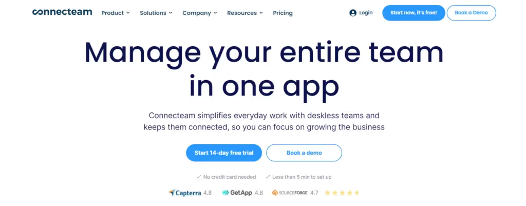
- Social Proof. Add Social Proof features with testimonials and ratings for credibility and trust.
- Clear Call-to-Action (CTA). The CTA message should be clear to readers. It should be in high contrast with the visual on which you will place it on the page.
- Value Proposition. Give something valuable in return for information that will identify the reader.
- Customization. Make the landing page customized to the audience's needs and segmentation.
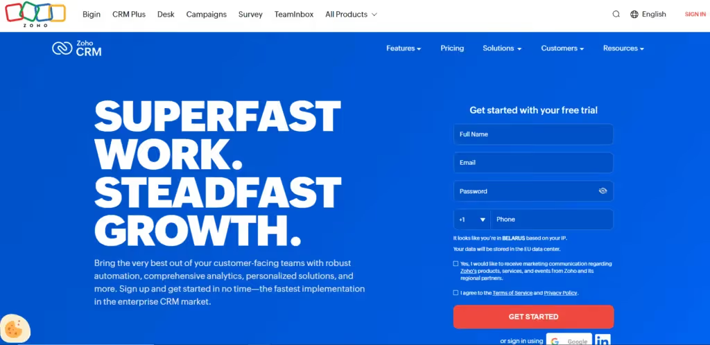
- Simple forms. Make sure that the forms on the page are simple and short so that a user will not be frustrated and leave the page.
Core Components of Successful SaaS Landing Pages
Mapping Out Key Elements
- Compelling Headline. Make this an aggressive headline by speaking directly to the problem the user is having and very concisely telling them how to find a solution to it.
- Unique Selling Proposition (USP). Communicate your USP clearly to differentiate your product from competitors; what makes your SaaS unique.
- Engaging through images. You can use great pictures, videos, or infographics to make the page interesting and enable visitors to visualize using the product.
- Social Proof. This would add elements like customer ratings and testimonials, which would be able to build credibility and trust.
- Clear and Strong Call to Action. Make good CTA buttons that will guide a visitor to proceed easily through the conversion funnel.
- Short Product Descriptions. Tell people what your product is rather than what it does so they know exactly what they're looking at.
Streamlining Design and Interaction
- Design a simple and intuitive design, clean with a modern layout and visually appealing, to enhance the user experience.
- Personalize the landing page under very specific conditions for the audience and stage in the buyer's journey, making it even more relevant and engaging.
- Blank Page. Make use of a minimalist page with less distraction. Have one clear CTA that guides individuals forward toward the action.
- Mobile-first Strategy. Expect half the traffic to come from the mobile audience, and make sure that the landing page is optimized for mobile responsiveness and speed.
Building Trust
- Transparency and Compliance. Foster trust right from the beginning by making a transparent, GDPR-compliant page design.
- More Resources. Include resources such as product tours, training documentation, and industry certifications for the added depth that results in user trust.
So, genuinely working into all these fundamental elements, your SaaS landing page can be highly improved to turn the visitors into leads and customers, thereby getting around an average conversion rate of 9.5%.
Social Proof and Building Trust
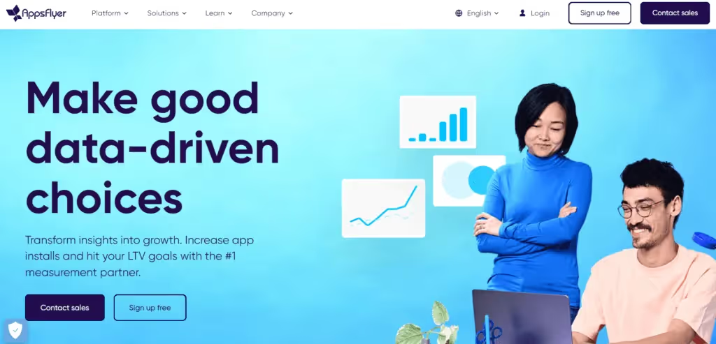
- Customer Testimonials and Reviews. Testimonials, reviews, and case studies from customers make your SaaS landing page a big deal. For example, on their website, AppsFlyer shows big accounts, such as Adidas and Coca-Cola, which right away give new visitors a sense of being trustworthy and reliable.
- User-Generated Content and Media Mentions. User-generated content and media mentions help build perceived value for your service. This not only helps build brand credibility, but leverages the authority of big brands in improving the trust building of customers.
Statistics on How Social Proof Works:
- In fact, 22% more memory is retained from a testimonial with images attached as opposed to simple text. Further, 68% of users trust reviews more when there is a mixed good and bad batch, in order to create realistic expectations.
- The Power of Client Logos and Awards. When a visitor sees client logos and awards on your landing page, it can do remarkable things for their perception of you. The recognition and simplicity of these things are one of the easiest and best types of social proof.
Building Trust Through Transparency and Compliance
- Trust Badges and Secure Payment Options. Examples of trust badges are an SSL certificate or safe checkout badge that would make the visitor feel safe about his or her data. Add payment logos, such as Visa and Mastercard, to further consolidate the fact that the checkout is secure.
- Clearly Displays Business Longevity and Expertise. Clearly specifying the number of years in business, along with any certifications or awards from industry associations, can communicate to the potential customer that the business is stable and credible.
You can then build a sense of trust, and by the same token, persuade potential customers by carefully integrating these elements of social proof into your SaaS landing page.
Optimizing for Conversion
Incentivizing Action
- To drive this last action home, offer some free content, a discount, or a deal that will persuade these leads to convert.
- Use an exit popup that gives away something valuable to prevent the visitor from leaving the page and hence minimize the bounce rate.
- Make forms simple and to the point; do not try to collect too much information from the user, unless absolutely necessary, to avoid overloading the user.
Continuous Improvement
- A/B Testing. Do A/B testing at regular intervals to find the strongest elements on your page. This can help you perfect strategies and up your game in user engagement.
- Page Speed. Ensure that loading time for your landing pages is fast, as quick loading is proportional to higher conversion rates.
- Track User Interaction. You can track how your users interact with the website page in order to iterate that and optimize on it.
Strategic Design Decisions
- Prevent Banner Blindness. Refrain from the use of generic banners and stock images that people tend to subconsciously train themselves to ignore.
- Smart Fields. Smart fields should be used in order to reduce monotony in forms—users do not need to be asked for the same information over and over again.
- Inspiring Button Copy. Create buttons with copy that invokes urgency and emotion, such as 'Unlock 20 SaaS Conversion Secrets Now'.
Social Sharing and Navigation
- Social Share Buttons. Place social share buttons that will help users easily share news about your special offers and, in the end, probably increase the coverage of your page.
- Minimal Navigation. Use minimal navigation in the design so that the user's focus is on the leading information and call to action.
With the implementation of these strategies and relentless testing, honing your approach—you can easily make your SaaS landing pages' conversion rates soar.
Mobile Responsiveness and Fast Loading Times
More than half of the web traffic today comes from a mobile device. For that reason, a highly effective SaaS landing page design will be responsive in nature. Responsive design allows to automatically adapt to various screen sizes and resolutions, presenting uniformly across all the devices. This improves user satisfaction and therefore drives better SEO rankings.
Speed optimization methods
And just so you keep your mobile users hooked, concentrate on fast load time. Since AMP is a framework that has been mobile-optimized, the load time is significantly faster. The load time for pages is because of the compression of images and media files, and each second weighs a lot to keep away adverse impacts on user engagement.
Testing and Adjustments
Regular testing on a variety of mobile devices guarantees that all elements on your SaaS landing page interact seamlessly with one another and hence display without any glitches. The insights gained here can be very useful in changing elements like the hero section or form lengths to be completely optimum and enhance the user experience.
Focus on these two dimensions of mobile responsiveness and fast load times to significantly up the effectiveness of your SaaS landing page, making it really attractive for mobile users and potentially converting them.
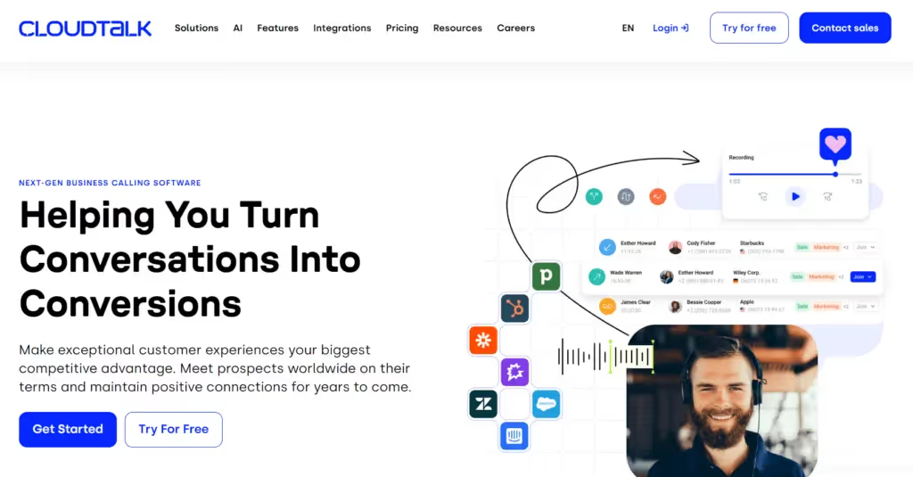
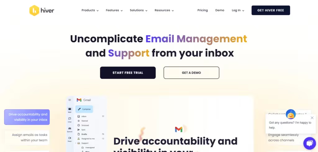
Learning from the Best: Successful SaaS Landing Page Examples


FAQ
1. What are the key elements that make up a high-converting landing page?
To create an effective landing page in converting visitors to customers, your page should contain a powerful, content-related hero image; clear, singular call-to-action; convincing headline and subhead line, spelling out your value proposition; and detailed features and benefits of your service, although the emphasis should be more on benefits.
2. What exact measures must be taken into account for designing a high-converting landing page for a SaaS product?
There are a couple of key things to consider while designing a SaaS product landing page. You need to create an impactful "hero section" to give off a strong first impression. Let the potential customer know that you understand and can solve their pain points. Quality product visuals should help improve understanding. Apply social proof to build credibility. Adress any objections preemptively. End with a strong call to action.
3. What, in your opinion, is the most critical element of a high-converting landing page?
The most important elements for a landing page that will effectively turn browsers into buyers are a good headline, striking imagery, strong copy, social proof, trust badges, and call-to-action buttons placed strategically. Each of these elements plays its part in leading the visitor to a conversion.
4. Could you mention some key elements of a SaaS landing page?
These are the key elements for a good SaaS landing page: 1) attention-grabbing headline and subhead line; 2) product screenshots or videos that show the product; 3) clear value proposition; 4) social proof and trust indicators with user testimonials; 5) call-to-action buttons; 6) and easy navigation for a smooth user experience.
Takeaways
As we've learned from this article, the anatomy of high-converting SaaS landing pages is quite complex. It brings strategic design and compelling content to the fore, besides adding mobile responsiveness and fast loading time. Following these principles, there is a good likelihood that your SaaS company will not only attract but also convert your target audiences into faithful users. The provided conclusions, supported by analyzed details and numerous real-life examples, might influence the final success of your SaaS product on this fiercely competitive digital market.
The implementation of these insights with precision requires expertise, and we are here to guide you step by step! Get in touch with us and discover how our landing page design services can elevate your business. We create landing pages that are not only visually appealing but also strategically built to maximize conversions and drive measurable results.
FAQs

February 2, 2026

February 3, 2026


.avif)

