7 Unexpected SaaS Ad Inspiration Sources

July 17, 2025

There are weeks when the ideas flow—and weeks when you stare at yet another product UI and can’t unsee the 147th shade of enterprise blue.
When that happens, I don’t force it. I leave the Figma file open, grab a notebook (or a screenshot folder), and go looking for something different. Not another SaaS ad—we’ve all seen enough of those. But stuff that hits differently. Stuff that reminds me how good visual storytelling can feel.
Here are the seven places I come back to when I need to shake off the sameness and build SaaS creatives that actually make you stop scrolling.
1. DTC Ads That Actually Make You Feel Something
🛍️ When B2C teaches B2B how to stop being boring

Direct-to-consumer brands are emotionally fluent. They build ads that hit you fast—with a vibe, a punchy visual, or a color story that doesn’t wait for your logical brain to catch up.
We love borrowing their confidence. A quirky color combo from a skincare brand? A layout from a home goods carousel? We’ll adapt it to a SaaS product story—and suddenly, the creative feels fresh again.
Where to look: Email digests from brands like Glossier, Studs, and Recess. Instagram stories. Pinterest boards with saved ads.
2. Real SaaS Landing Pages—Not From the Hall of Fame
🌐 Honest design > award-winning sameness.
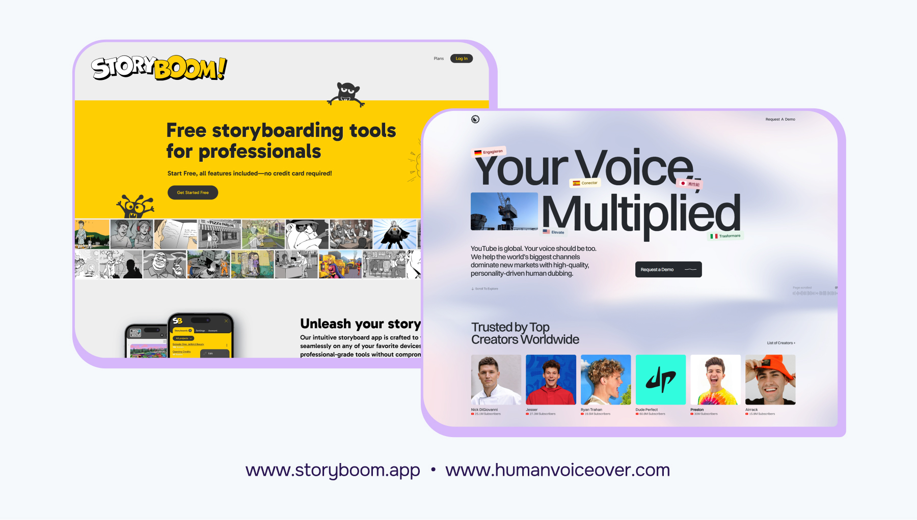
We’ve all bookmarked that one perfect SaaS website. But the magic often lives in the underdogs—smaller tools, niche apps, and early-stage startups still figuring things out.
They’re not trying to impress a jury. So they experiment more: oddball 3D art, unusual layouts, and copy that talks like a human. We’ve pulled entire creative hooks from landing pages like these.
Where to look: Product Hunt. Indie Hacker launches. Seed-stage startup newsletters.
3. Mobile Apps Outside the SaaS Bubble
📱 Because fintech and food apps know how to design for interaction.
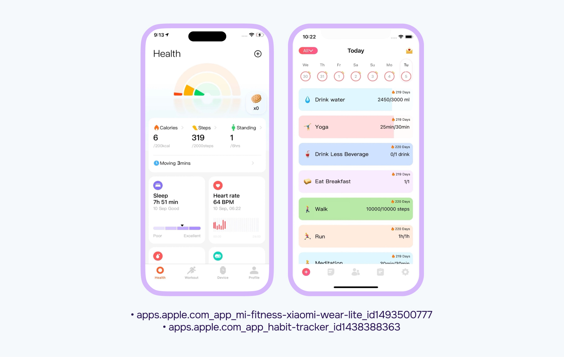
Real SaaS Landing Pages — Not From the Hall of Fame
There’s so much life in mobile UIs. A weather app with an animated loader. A banking app with sharp tooltip UX. A fitness app with smart microcopy on buttons.
Studying those details gives us fuel for SaaS campaigns—especially when we want to add motion, delight, or a clear next step.
Pro tip: Screenshot tooltips, animations, and loaders. Build a reference folder. Revisit it when you're feeling stuck.
4. Digital Art, Posters, and 3D Illustration
🌀 Show the feeling, not just the feature.
.avif)
Sometimes, the best ad creative doesn’t show a product at all. It shows a mood.
We often explore digital art, motion graphics, and modern poster design when we want to communicate emotion visually. It helps soften the “software” vibe and signal what the product experience actually feels like.
How to use it: for top-of-funnel visuals, hero images, brand campaigns, or intro frames in carousels.
5. Packaging Design
📦 What if your SaaS product was a can of cold brew?
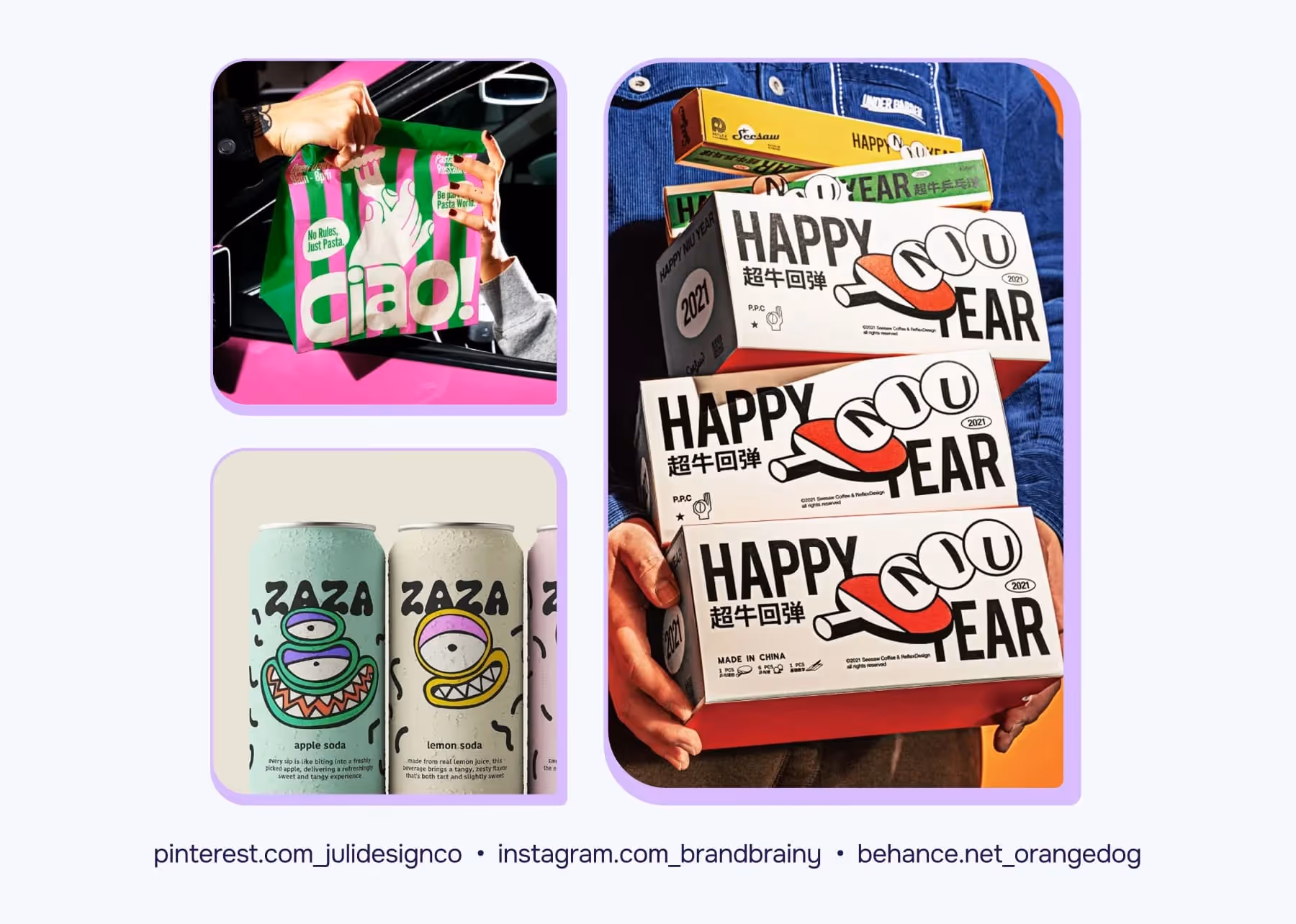
Packaging has no time to waste. It needs to grab attention, show value, and make you feel something—all from a shelf. That’s why we study it.
Think: bold typography, strong contrast, texture, and hierarchy. These rules apply to scroll-stopping ads too.
Where to look: specialty coffee brands, energy drinks, and indie beauty. Pinterest and Behance are goldmines here.
6. Big Tech Keynotes & Slide Decks
🎤 Simplicity that signals confidence.
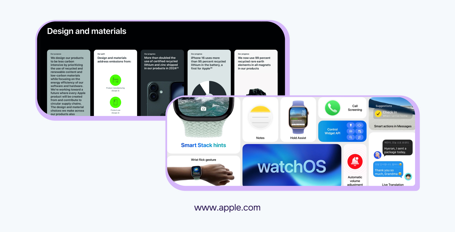
Apple’s slides are masterclasses in rhythm. Notion’s launch decks are soft-spoken but confident. Stripe’s docs? They look better than most websites.
We don’t copy layouts, but we do steal tone, pacing, and how they use space. It’s especially useful when building ad creative for C-suite SaaS audiences.
Focus on: how they break up content, frame benefits, and use white space to draw attention without shouting.
7. Street Signs, Wayfinding, and City Typography
🚏 Design that has to work at 40 km/h.

Nothing beats walking through a new city and noticing a perfect subway sign. Or a wild color combo on a kiosk. Or an old-school neon font.
This stuff teaches urgency. Street design is made to be scanned, not read—and performance creatives need the same kind of clarity.
Reminder: Take photos. Build a folder. Even one bus stop can inspire a high-converting LinkedIn ad.
FAQs
February 24, 2025